Centre Point Hotels & Resorts: case study

Find Your Centre
A positioning and brand refresh for Centre Point Hotels & Resorts, with a colour system taken from its own rooms.
The brief
The challenge
Centre Point asked us to move away from magenta as its hero colour, because it overlapped with Vivanta. The magenta lotus logo had to stay. It was an emotional decision, and the lotus carries the recall of a long-established hotel. We needed a hero colour that works beside it and stands out because no one in Indian hospitality owns it.
Our approach
We wrote a new positioning, Find Your Centre, built on three guest truths and five territories. For colour, we mapped the landscape and found one open territory, an earth-red already in the renovated rooms. Oxidised Clay became the hero. The type is Montserrat. The logo stayed untouched, with every new colour set beside the magenta lotus.
How we got there
The positioning starts from three guest truths.
- 01Space to yourself.Comfortable arriving, dining and exploring alone.
- 02Connection on your terms.Easy to meet people, never pushed to.
- 03Consideration in the details.Looked after without having to ask.
Positioning
Find Your Centre.
The master promise: Indian hospitality, contemporary comfort and understated warmth, in every part of the stay.
Creative direction
Five territories carry the promise through the stay. Each has its own “Find your…” line, used only where it fits the moment.
Tap a ring to open it.
Colour landscape
Every obvious colour is taken.
We mapped the colours of Indian urban hospitality. Gold, plum, blue, citrus, red and the neutrals were held. One territory was open: a warm earth-red, already in Centre Point’s rooms.
Centre Point · Oxidised Clay #A65F4B · Open: earth-red
ΔE is colour distance from Oxidised Clay. The higher the number, the further apart the colours look.
An indicative reading of public brand expression, not official brand specifications.
Colour from the room. Type from the wordmark.
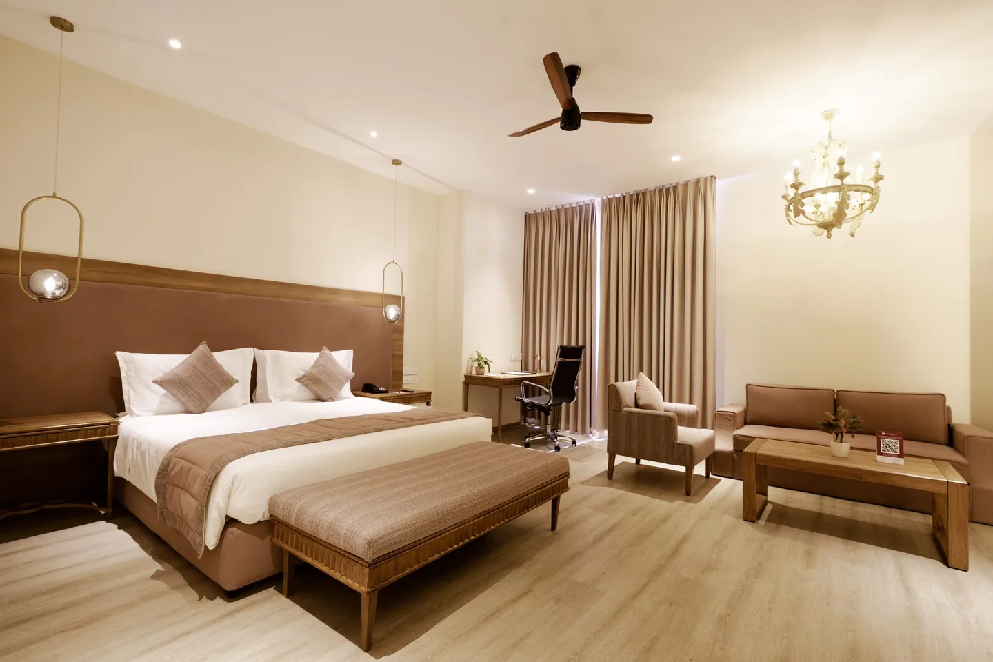
Every colour is taken from the renovated rooms.


The client kept the magenta lotus. It sits on white or Cloud Dancer only; on clay, the logo is white.
Montserrat
- LightCENTRE POINT
- RegularCENTRE POINT
- MediumCENTRE POINT
Instrument Serif
- RegularFind Your Centre
- ItalicFind Your Centre
Montserrat is the brand typeface, closely matching the wordmark’s wide, round, light letters. Instrument Serif is kept for the tagline alone.
Guest collaterals
Bougainvillea’s menus and the hotel’s signage, door tags and welcome cards, in Oxidised Clay.
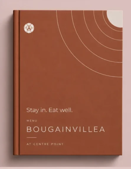 Menu
- Signage
- Door tags
- Welcome card
Why sans
Several heritage hotel brands have moved from serif wordmarks to simpler sans or near-sans letters. Raffles now sets its name in wide sans capitals. Mandarin Oriental’s 2025 wordmark is a slim, wide near-sans. Atlantis built its 2021 sans serif logotype for “clarity across resort signage, print, and digital touchpoints.” Montserrat gives Centre Point the same clarity on signs and screens.
The work
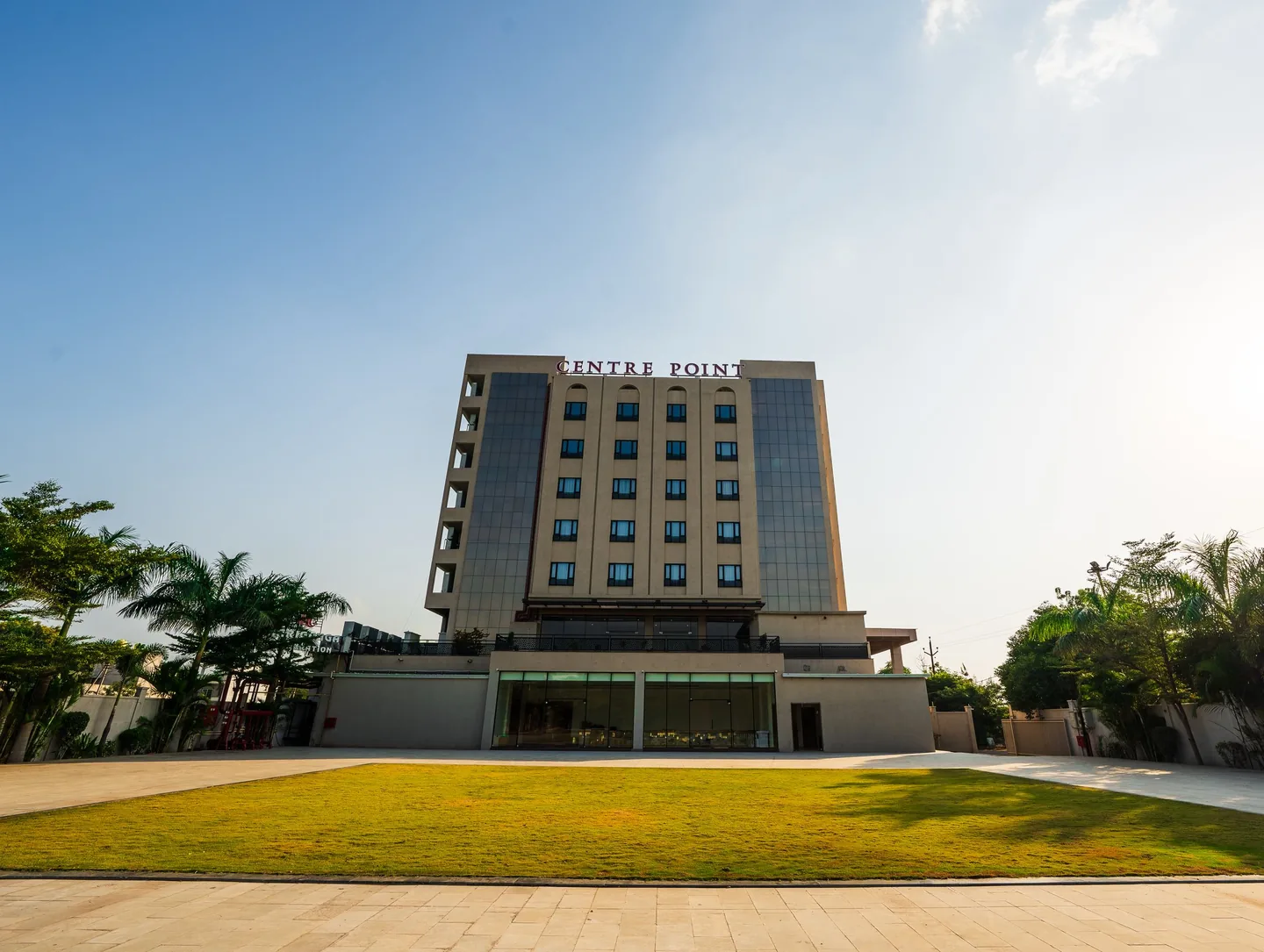
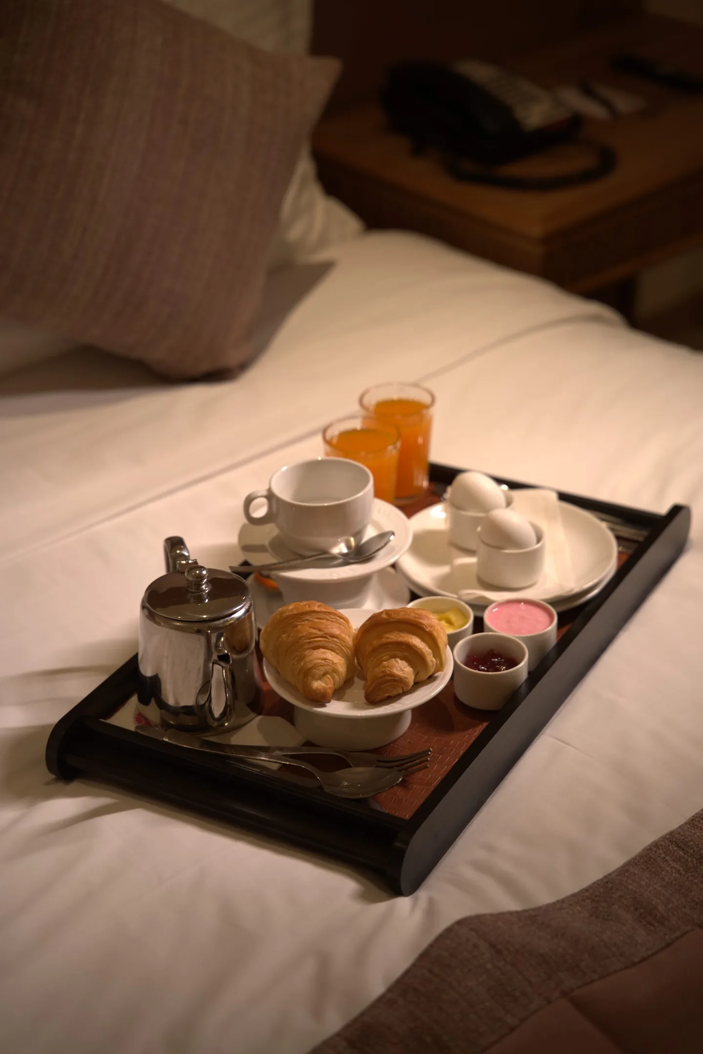
Photographed and posted by EHR, from arrival to breakfast in bed.

Find Your Centre.
Book a call Micky’snext case