Micky's: case study
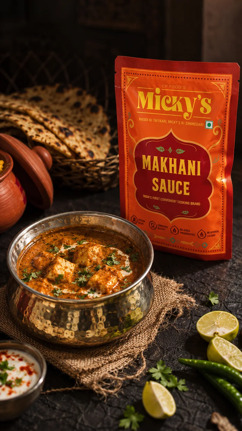
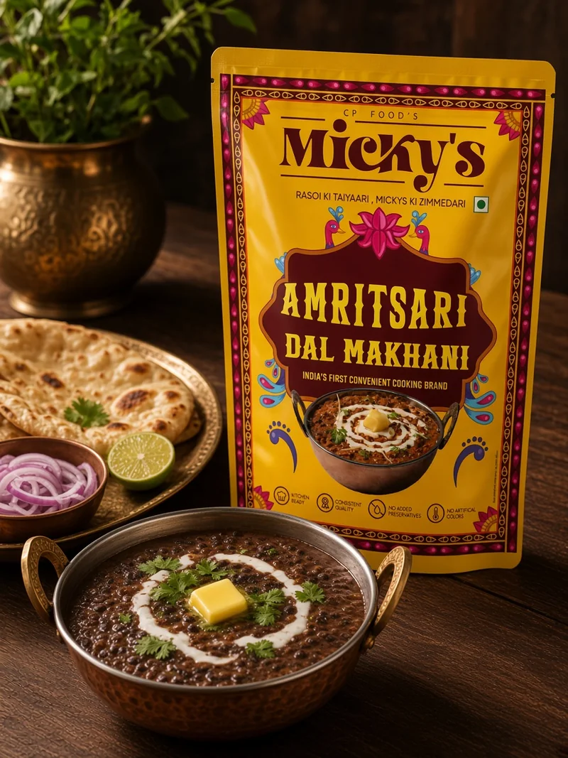
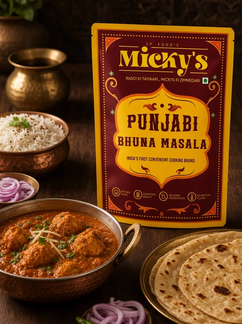
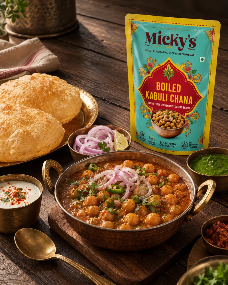
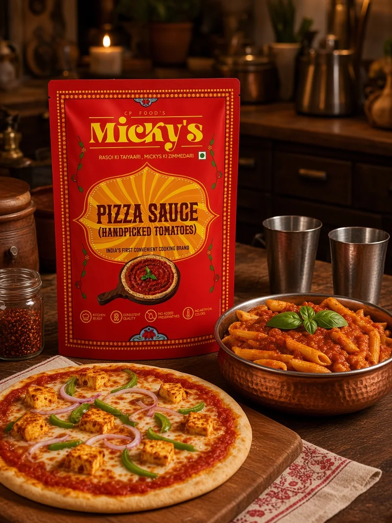
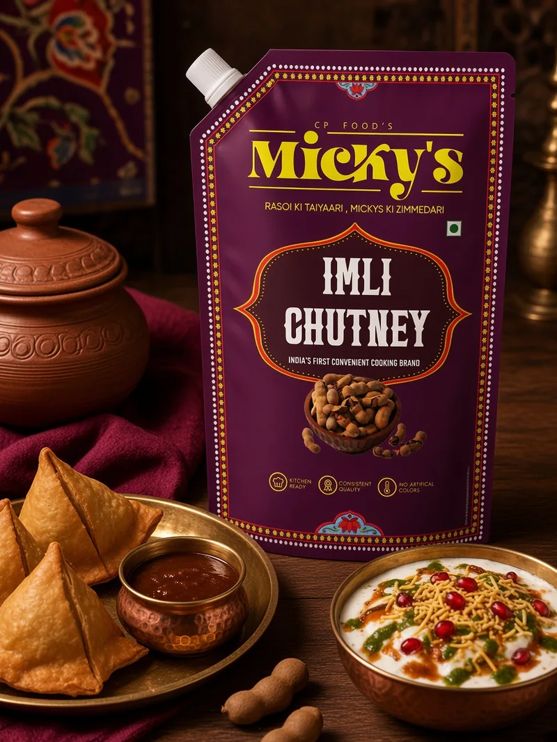
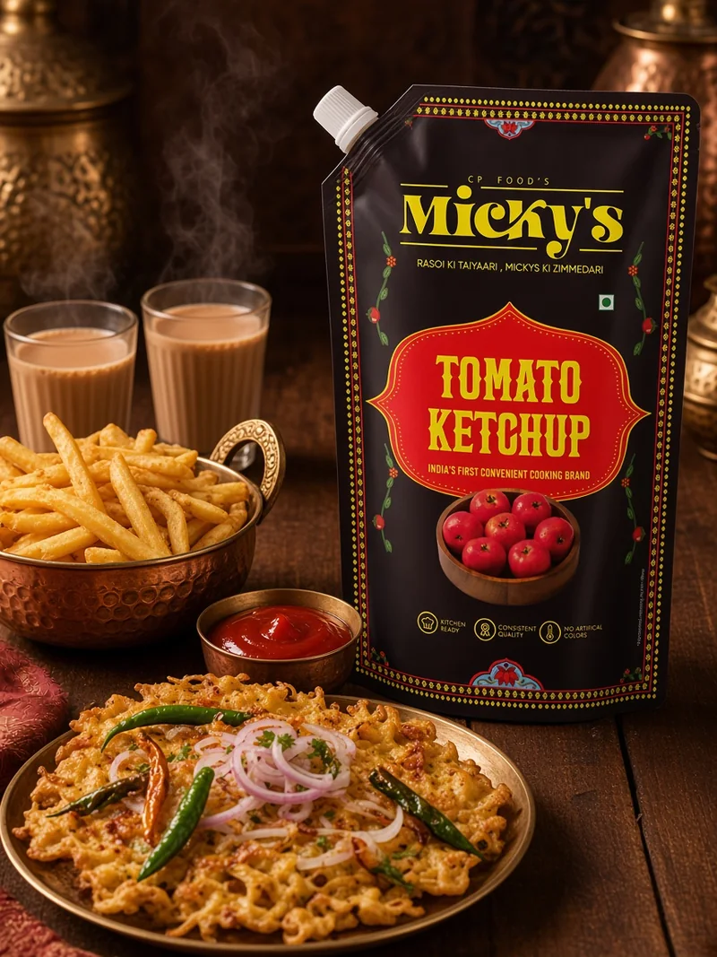
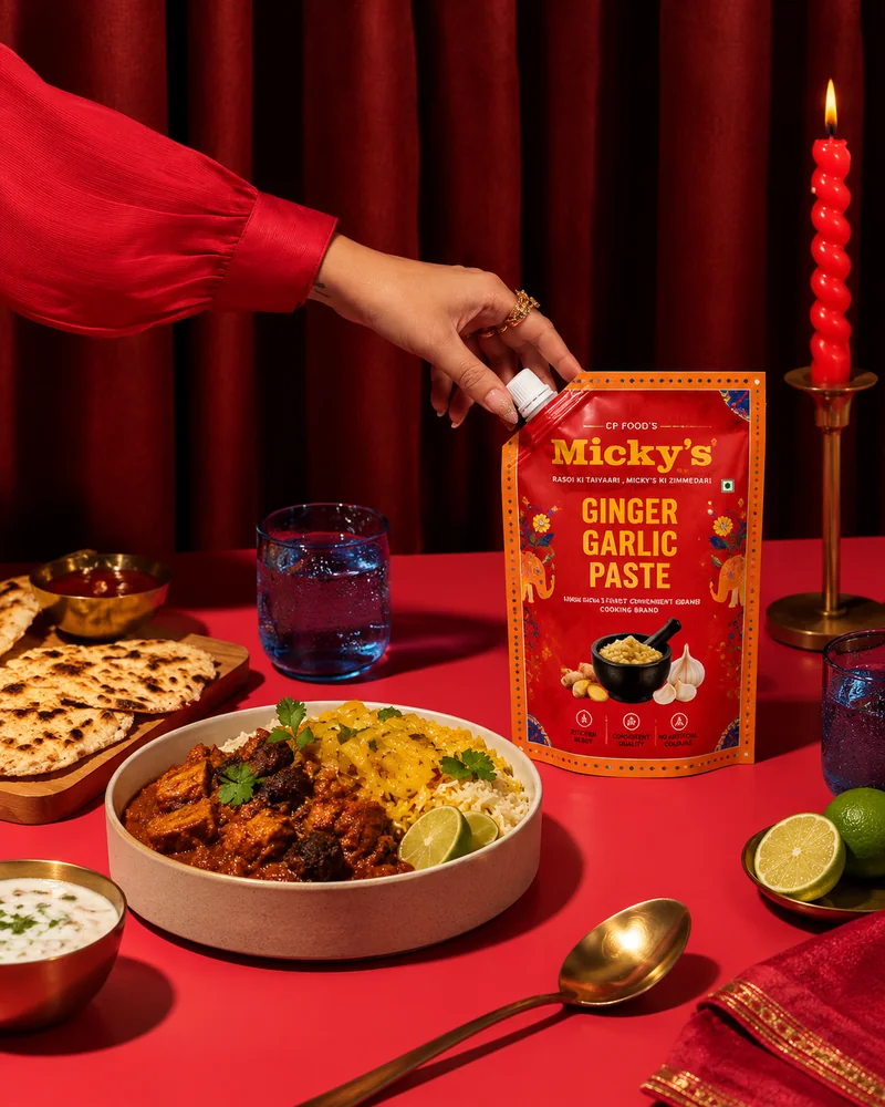
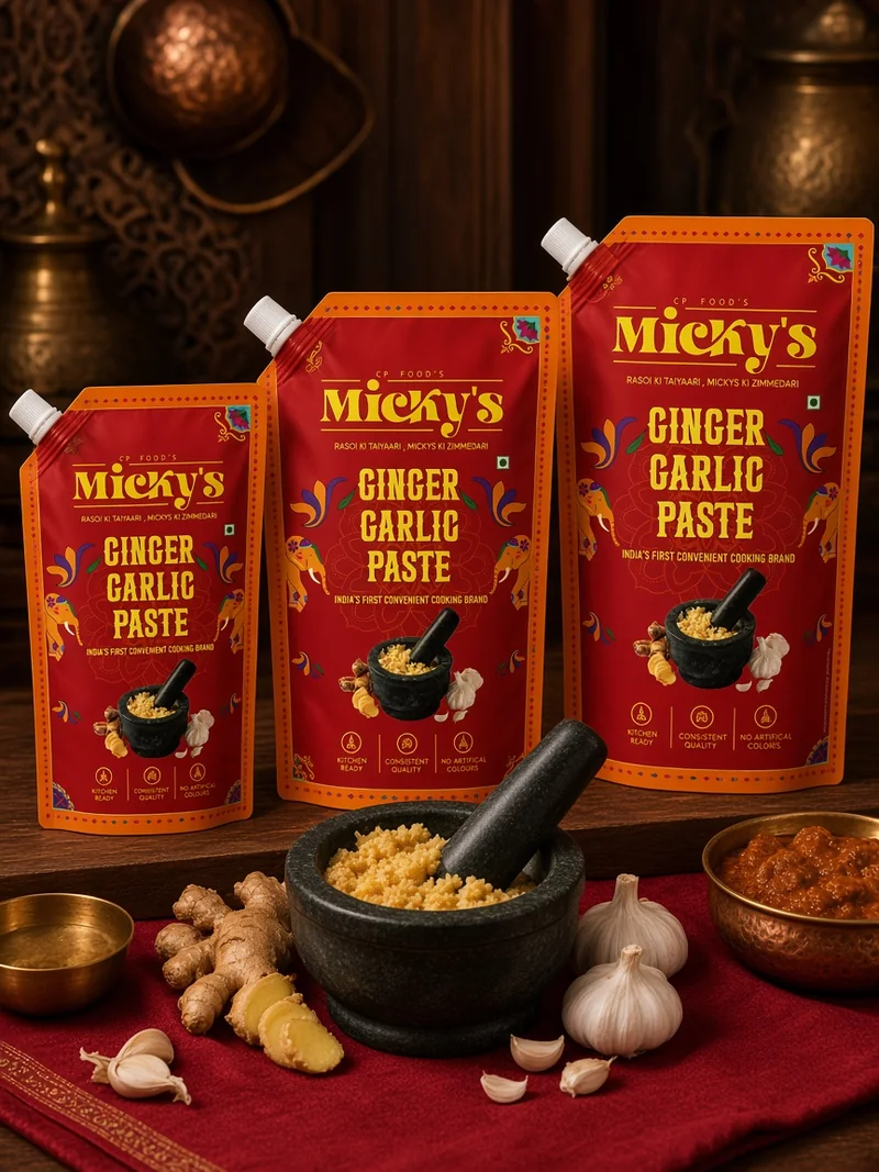
Each product is shot with its own pack colour in the frame. The rule comes from the social deck: at least one element in every photograph matches the pack. The photography repeats the colour coding the shelf uses.
The Challenge
Trusted by chefs. New to the home.
Centre Point Hospitality has cooked for the hospitality trade for four decades. Micky’s grew out of those kitchens and earned strong traction with hotels, restaurants and caterers. The next step was home, to moms. A brand built for chefs had to earn its place in a mom’s kitchen.
The Idea
One country. Every state in its own colours.
Micky’s does the kitchen legwork, so moms do the fun part and actually enjoy cooking. To carry that home, we looked to truck art. It’s on every road, north to south, yet each state’s trucks speak their own culture. Micky’s is a pan-India range with food from across the country. One language holds it together. Each product keeps its own colour.
Homecoming
Micky’s is named after Mr. Jasbir Singh G Arora, known to everyone as Micky. He has been a colourful person all his life, and his hospitality is the same: warm, generous, always going the extra mile. That extra mile is at the centre of Centre Point Hospitality. We took the warmth and colour of the man and made them the brand’s language. That’s why Micky’s is full of colour, and why truck art fits: bright, warm, generous and out on the road.
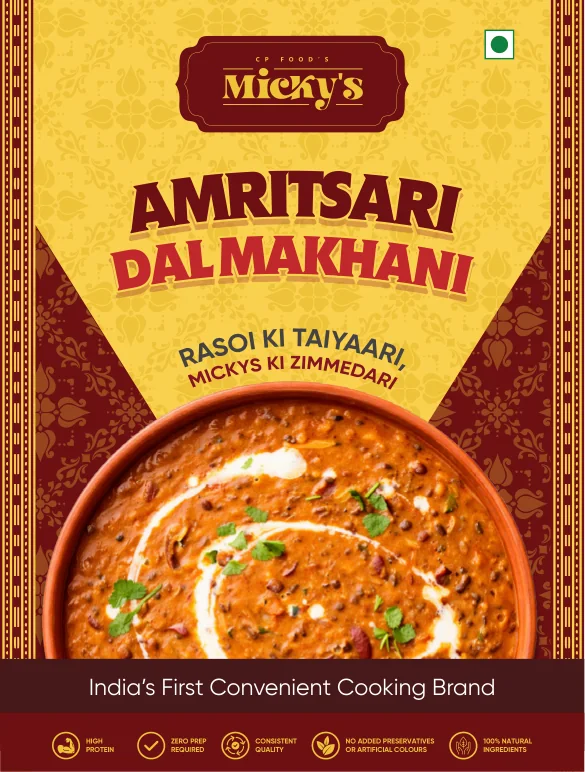
The brief asked for maroon and yellow, and the first packs delivered it. The identity and its Hinglish voice worked. The packs didn’t: the client found them more traditional than young. That look sat well in HoReCa, where chefs already trusted Micky’s. On a retail shelf, beside legacy brands, it would blend in.
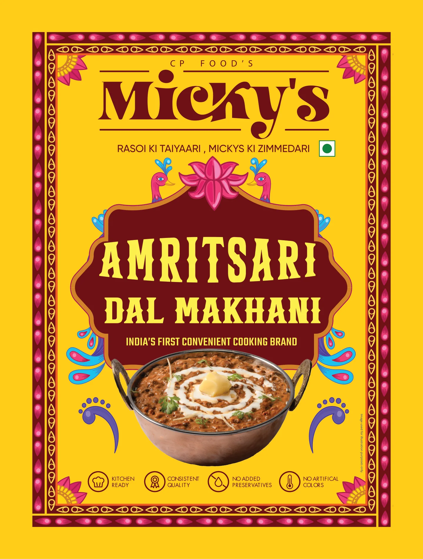
So we redid the packs before print. They stayed in truck art, and each product family got a bright colourway of its own. The wordmark and the maroon carried over from the first system. A Micky’s pack now pops on the shelf among the legacy brands, and that is what drives discovery.
(Share of the 11 launch products)
Every pack keeps the same constants: the Micky’s wordmark at the top, the dotted border and the badge row at the base. The colourway changes with the product family. Eleven products, eight colourways. The colour tells you which kind of product it is. The constants tell you it’s Micky’s.
The launch range
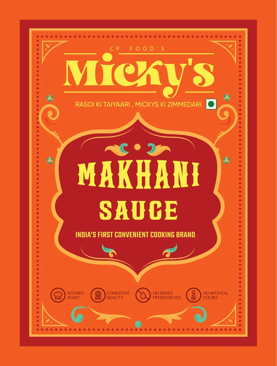
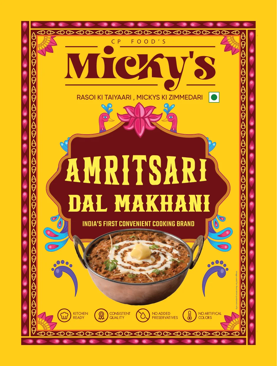
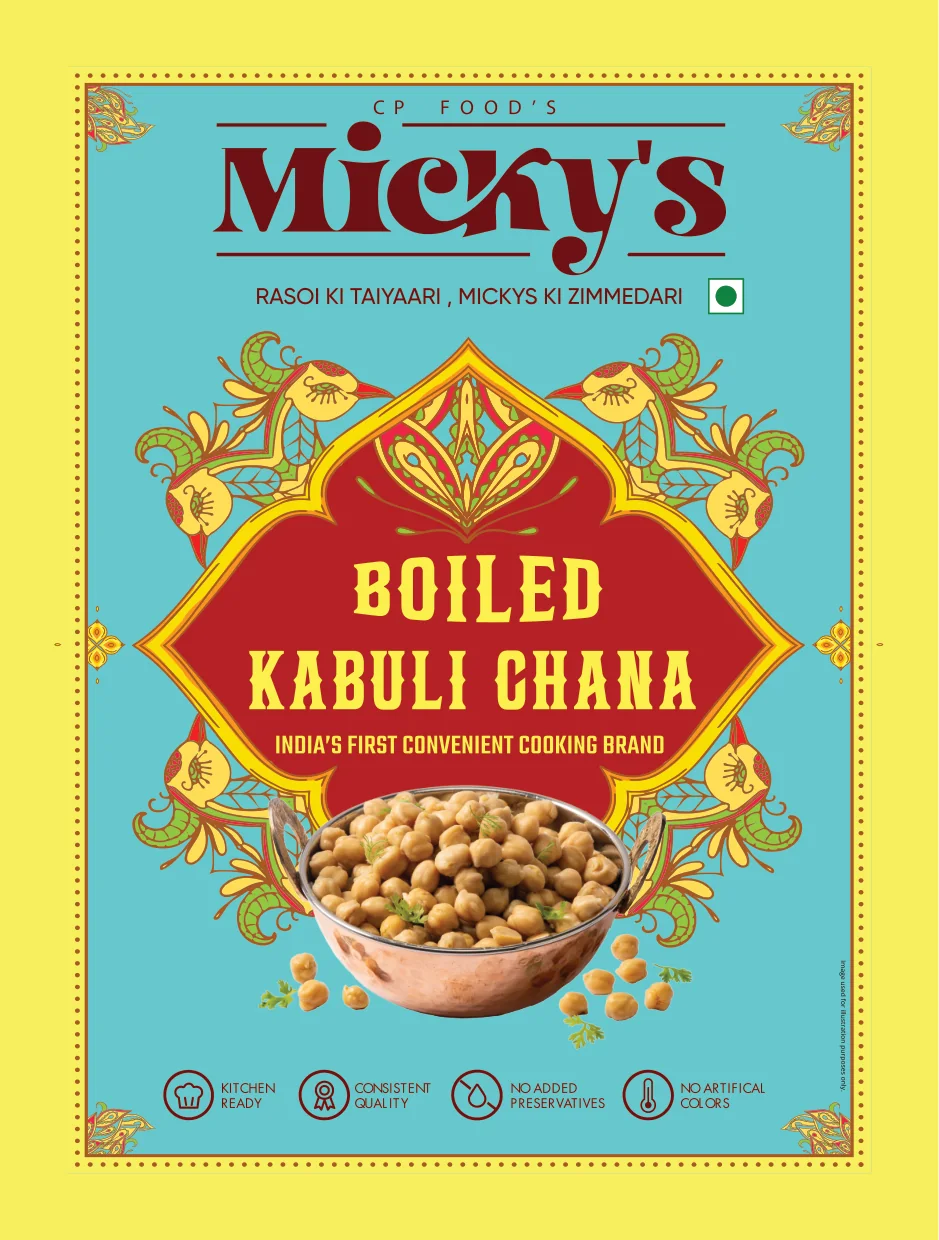
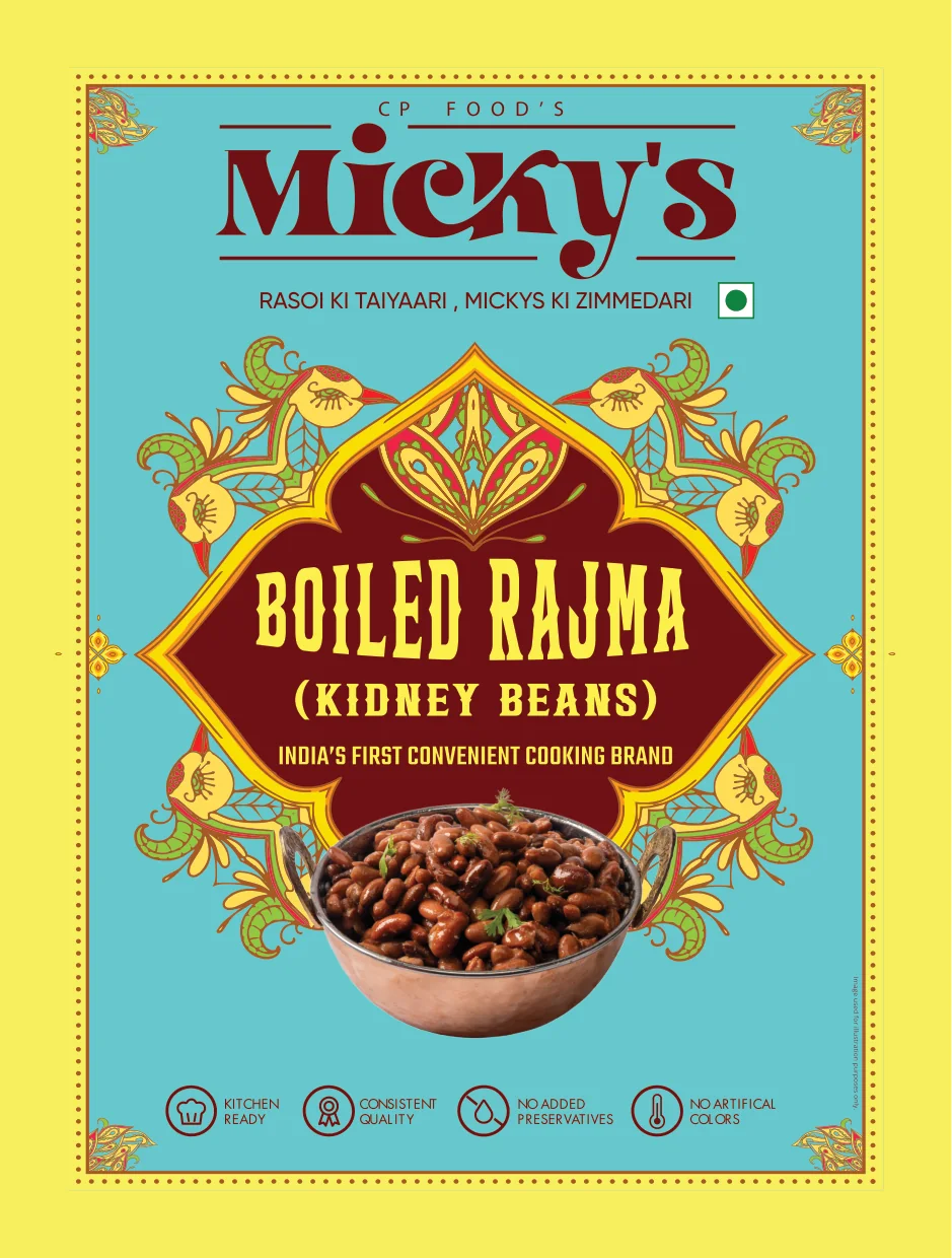
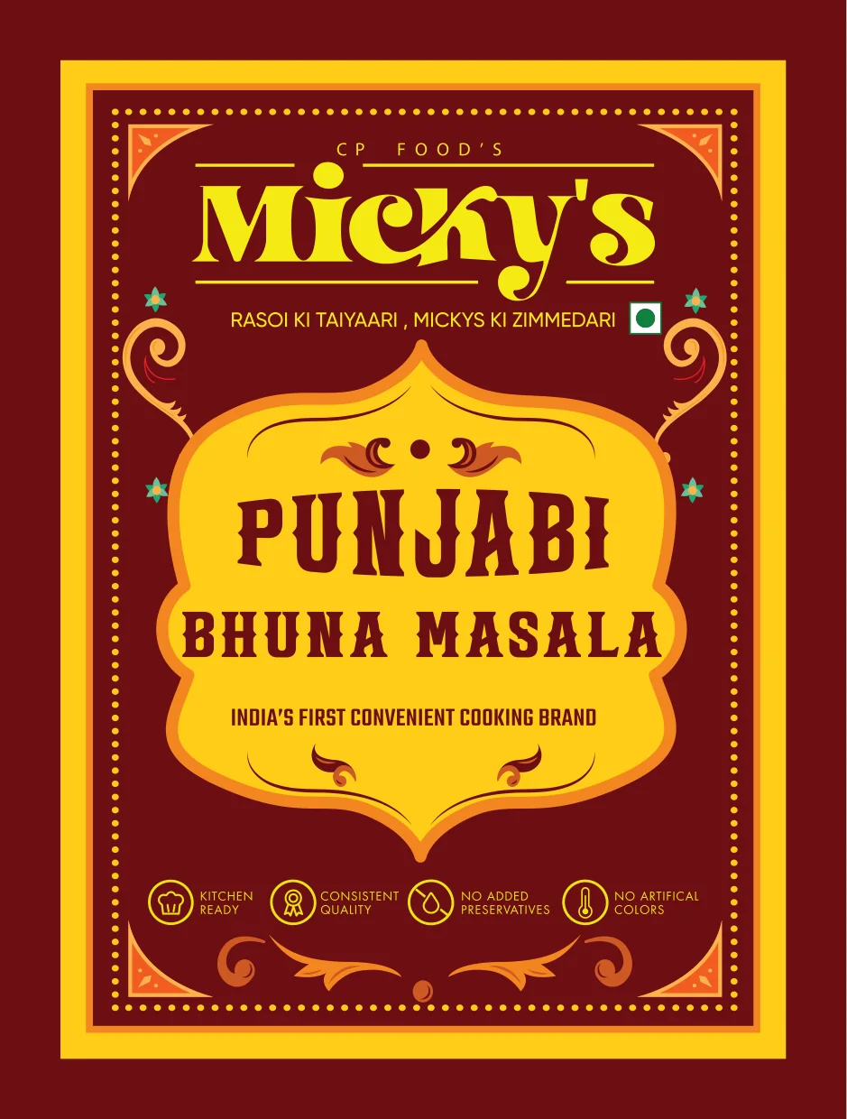
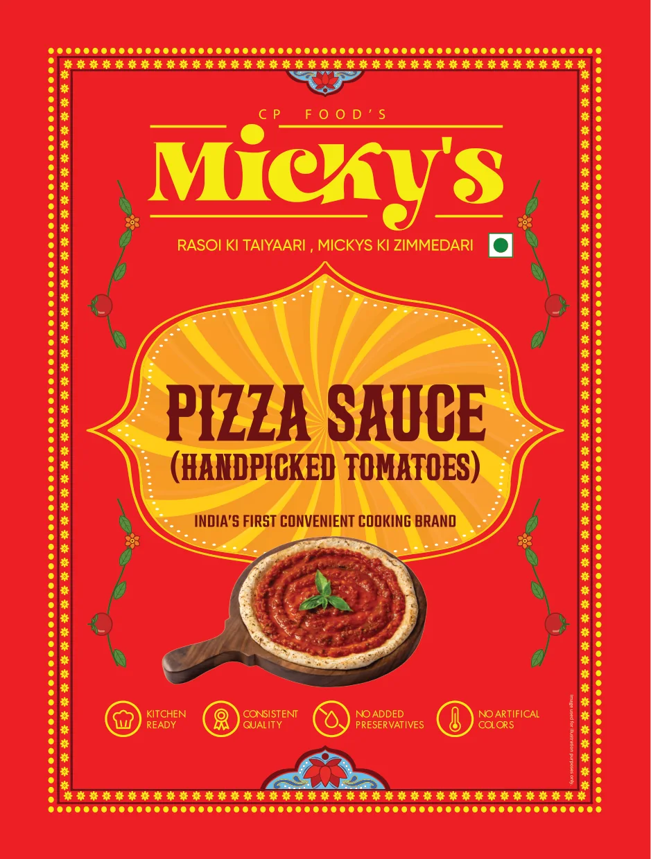
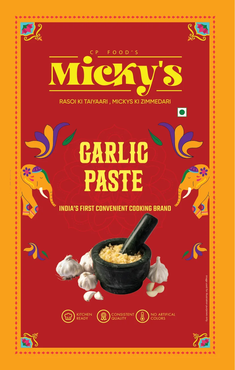
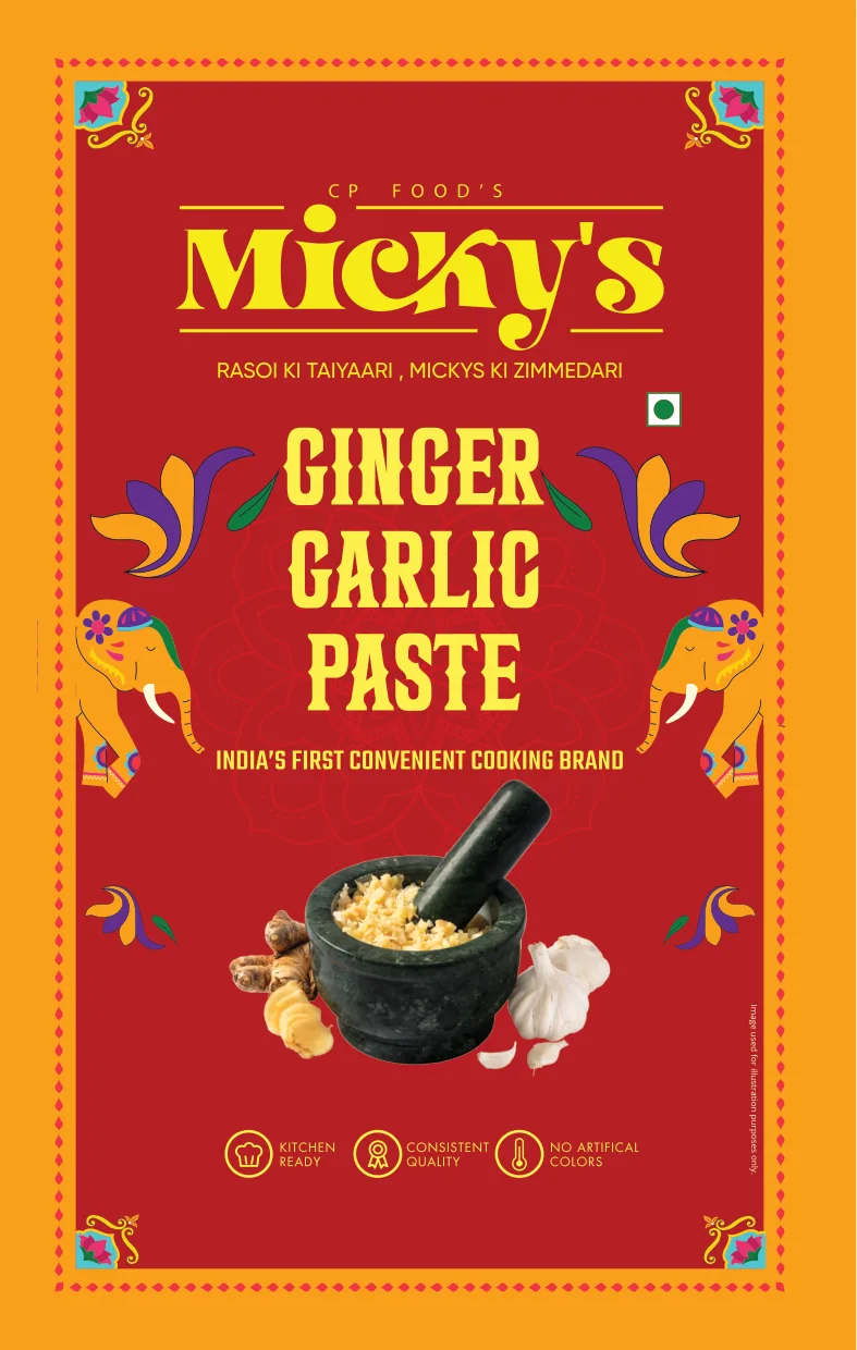
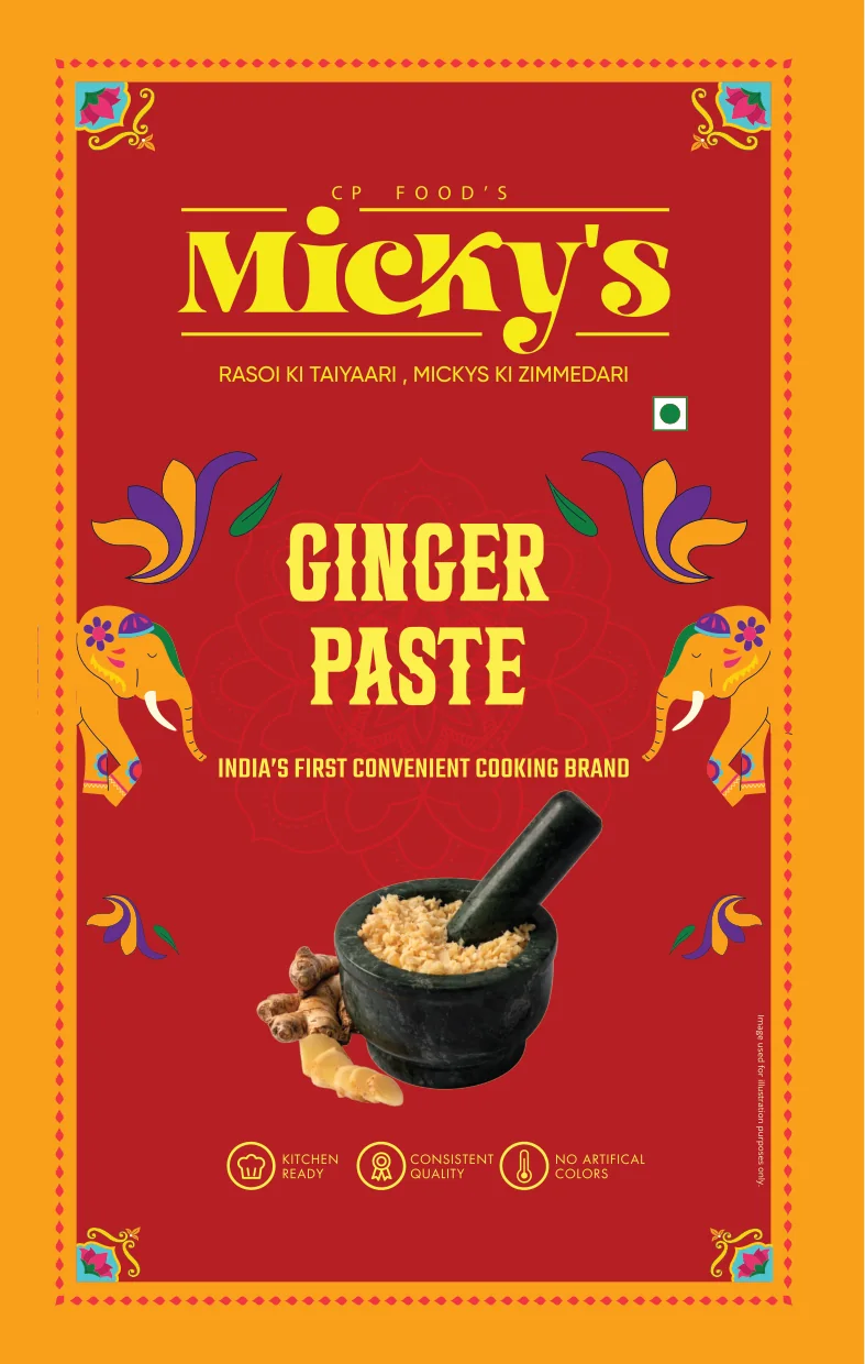
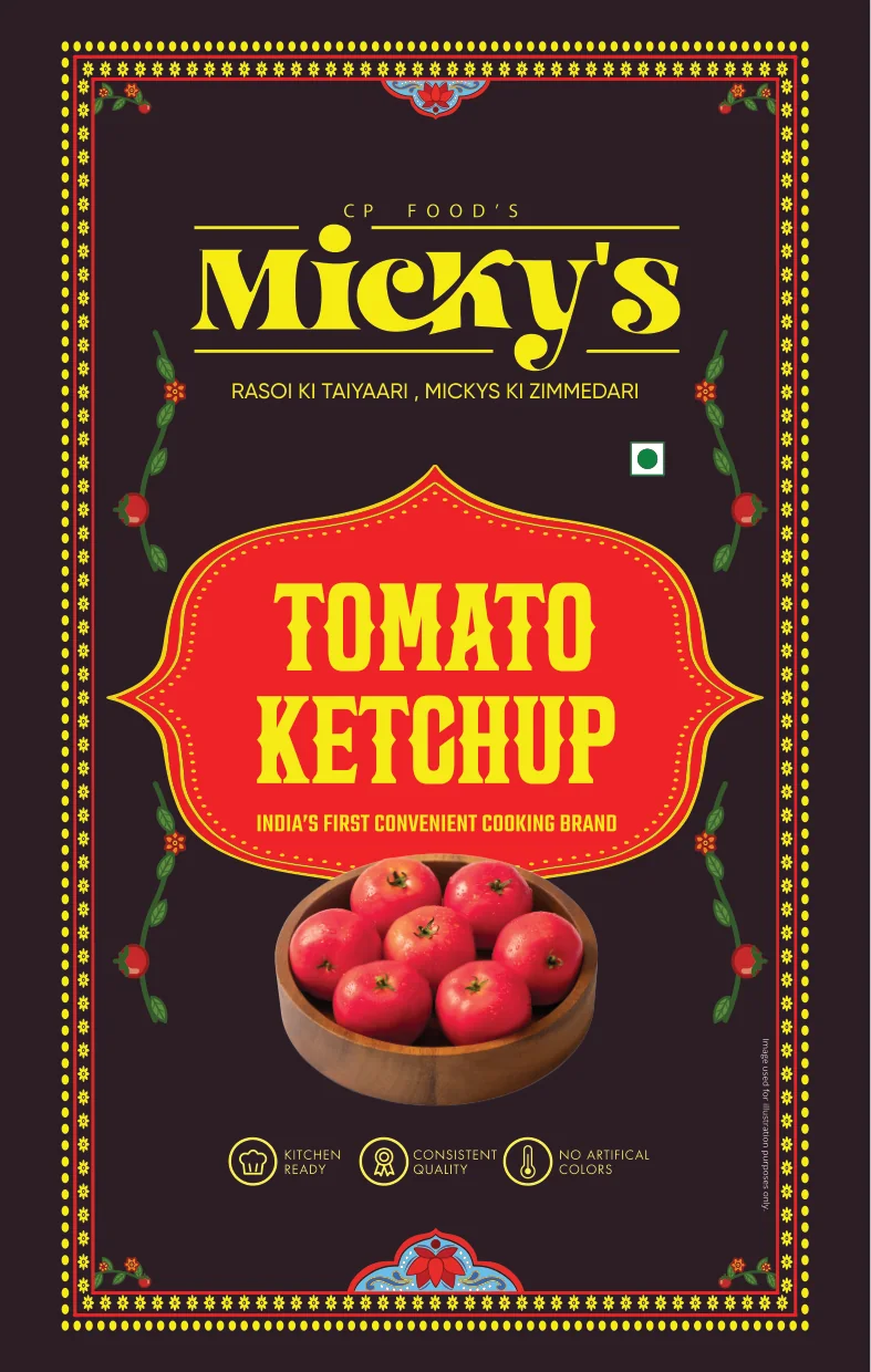
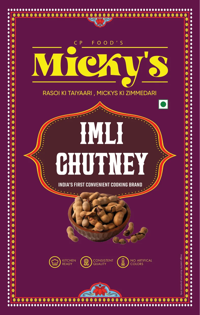
Six retort pouches. Five spout pouches. One frame for all of them.
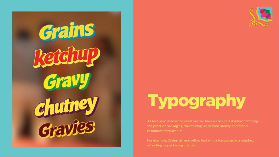
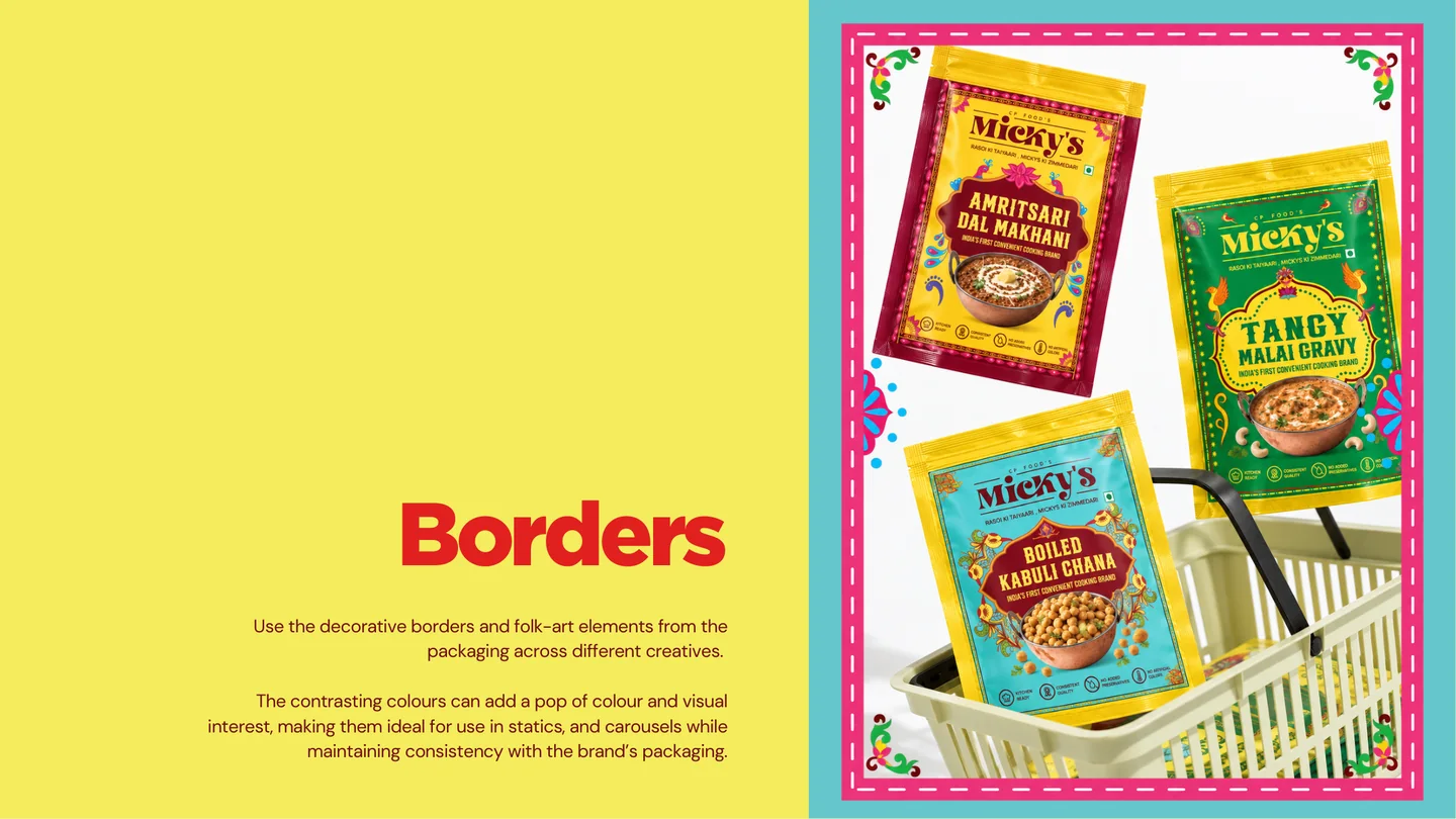
Micky’s had to look like one brand wherever people meet it, on a shelf or in a feed. So the pack identity became the rulebook for social.
Every line of type casts a shadow in the pack’s colour: grains, for example, get yellow type with a turquoise shadow. Every photo has at least one element in the pack’s colour. The folk-art borders from the packs frame the posts. A post reads as the same product as the pack before you read a word.
A new content IP
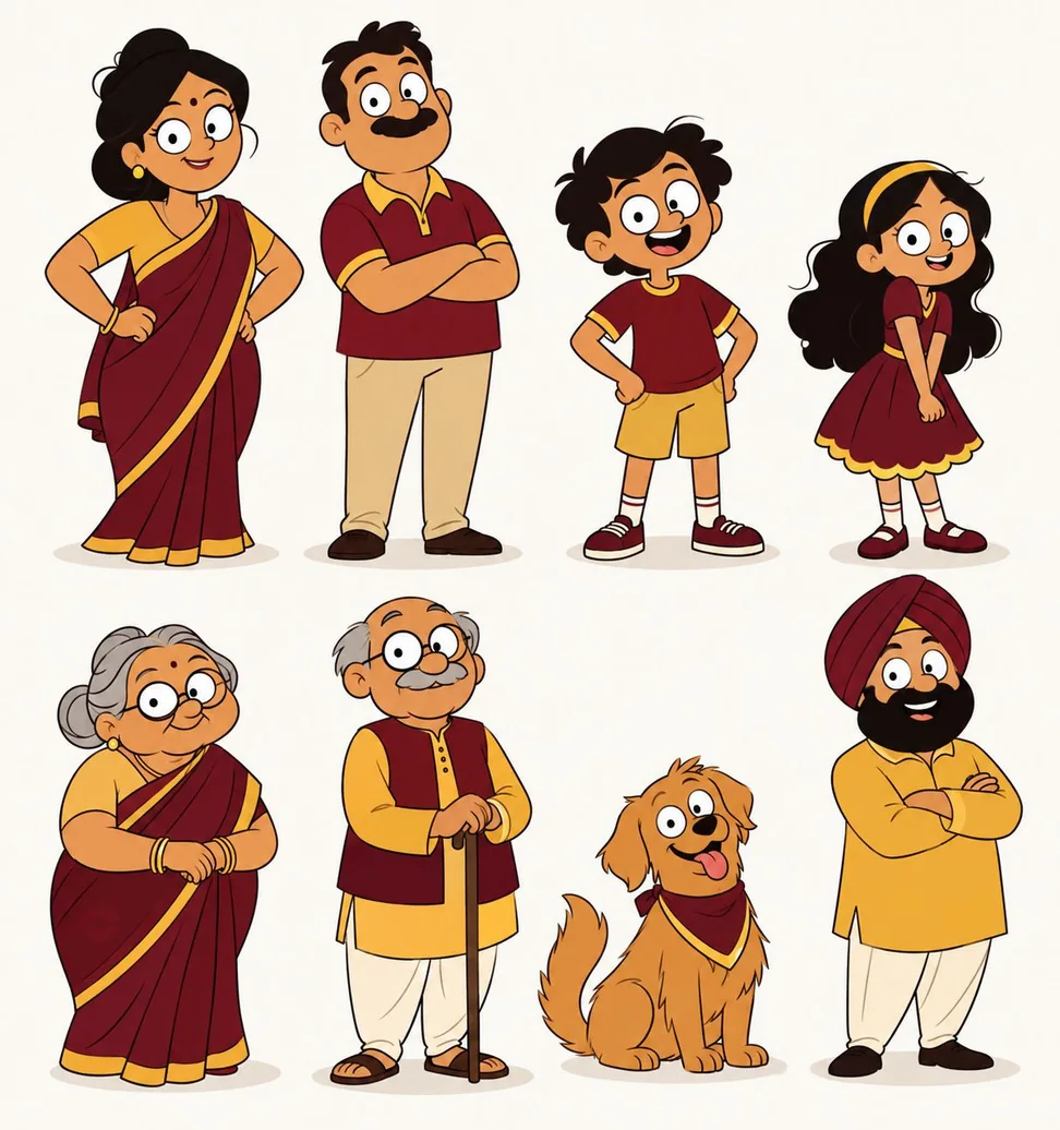
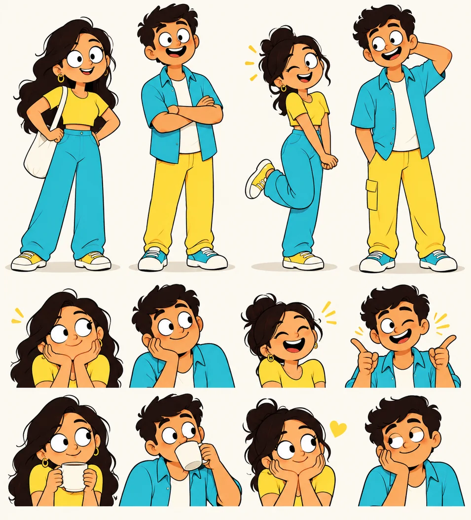
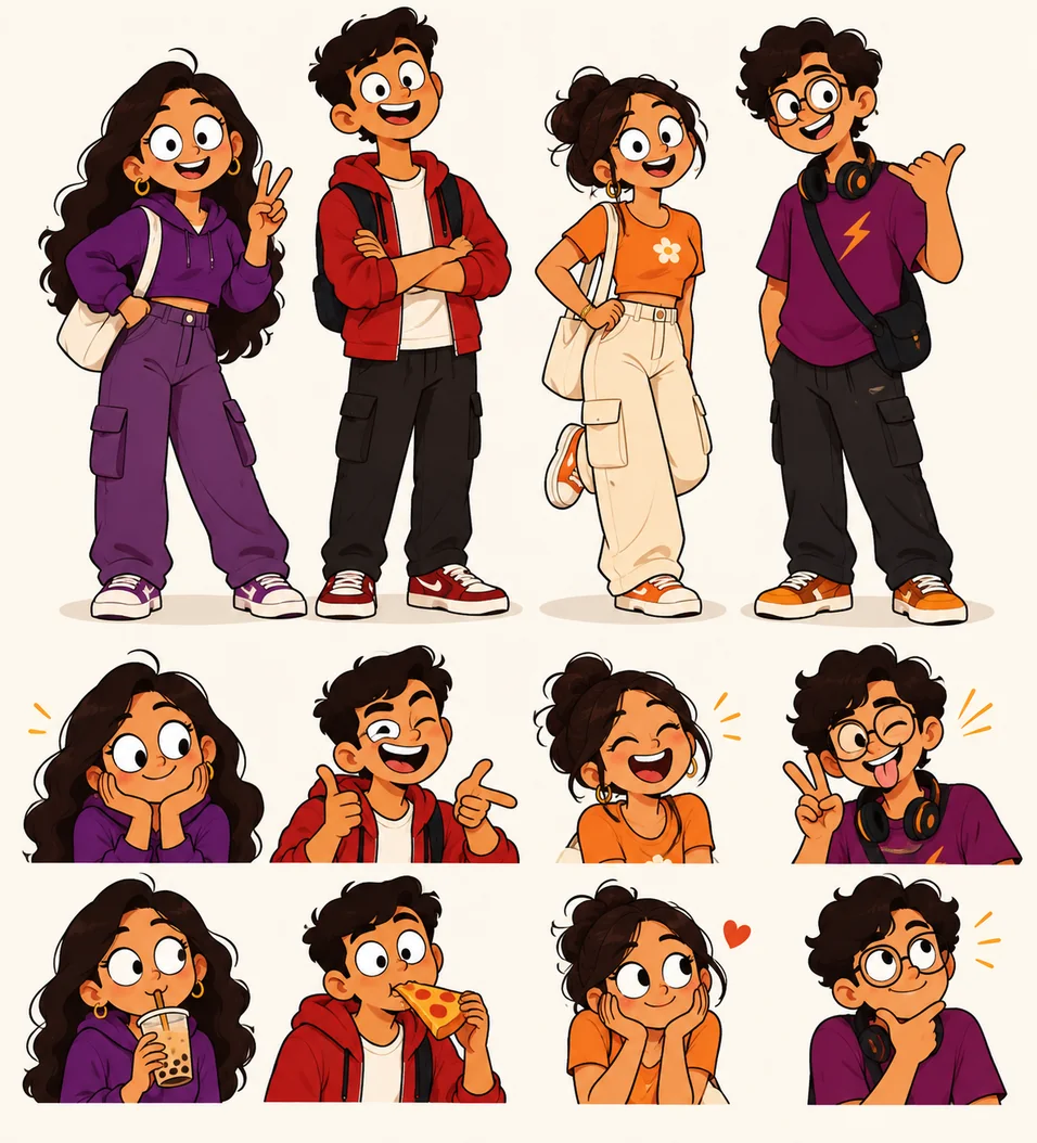
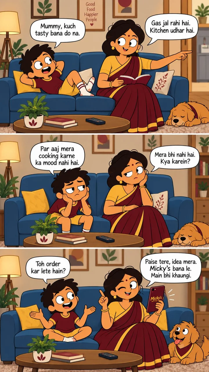
Indian brands have gone social-first with recurring illustrated stories: Kingfisher Ultra with a weekly slice-of-life webcomic, Too Yumm with its manga-style Mangaverse. A recurring cast gives people a reason to come back, and it lets the product sit inside the story instead of selling at them. So the content strategy gave Micky’s its own comic IP: three series, each with its own cast.
We mapped each category to the audience where its consumption peaks, and wrote a storyline for each.
Gravies for families. At a family table, everyone wants something different: Dad wants paneer, Mom wants something quick, the kids want butter chicken, and Dadi has her own opinions. A gravy is cooked once and shared by everyone, so the series runs on one line: “One gravy, everyone’s happy.”
Grains for couples: The Couple Chronicles. Couples who both work, or who have a second shift after the office, have no time to soak and boil grains, and the same debate every day: what should we eat, and who’s cooking? Micky’s grains come boiled, so the soaking and boiling are already done. The strips play out that everyday tension and end on a home-cooked meal.
Sauces for Gen Z: The Gen Z Gang. College students and young professionals: friends hanging out, midnight cravings, house parties. A ketchup or a chutney belongs in those moments. The series runs on “A little sauce, a whole new vibe”, saucy and sassy.
- Rasoi ki Taiyaari, Micky’s ki Zimmedaari, Bas Micky’s Daalo, Sibling Code
- Rush Hour ka Right Hand, A little sauce, a whole new vibe, Order aaya? Ho Jayega!
- Khana banega fast, flavour hoga blast, I Survive Rush Hours, Good Food Brighter Days
- Staff kam hai? Micky’s kaafi hai?, Rush zyada hai? Micky’s kaafi hai?
The voice stayed when the packs changed: young, Hinglish and a little cheeky. The client kept it because it worked, and it runs across the packs, badges, social and merch. Moms are the buyer today. To stay relevant with millennials and Gen Z, the generations setting up kitchens of their own, the brand has to feel young. Recent research on younger shoppers, from Emplifi and Edelman, points the same way: they respond to brands with humour and personality, when it feels authentic and in tune with their culture. A youthful voice keeps a practical product relevant, and it makes it more memorable.
Rush Hour ka Right Hand
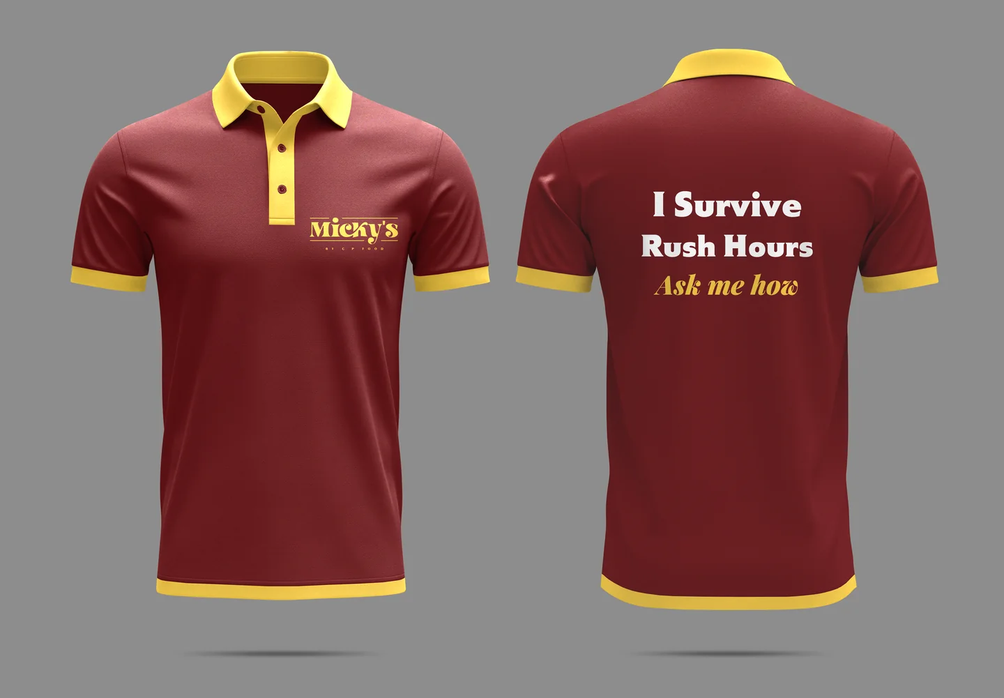
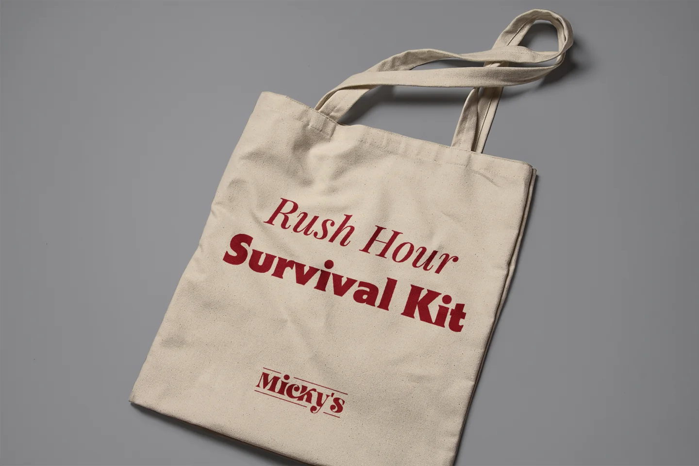
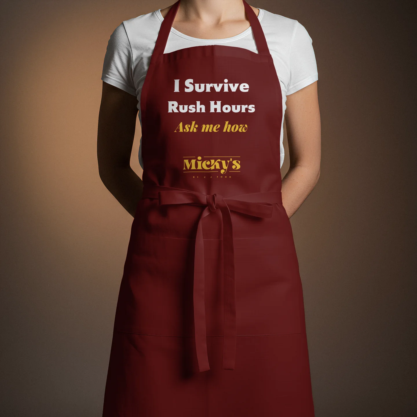
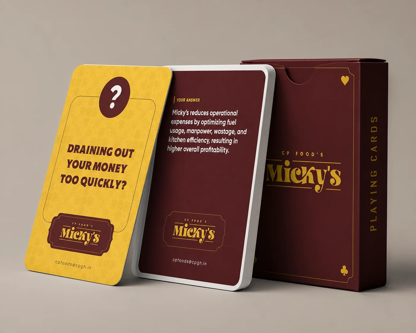
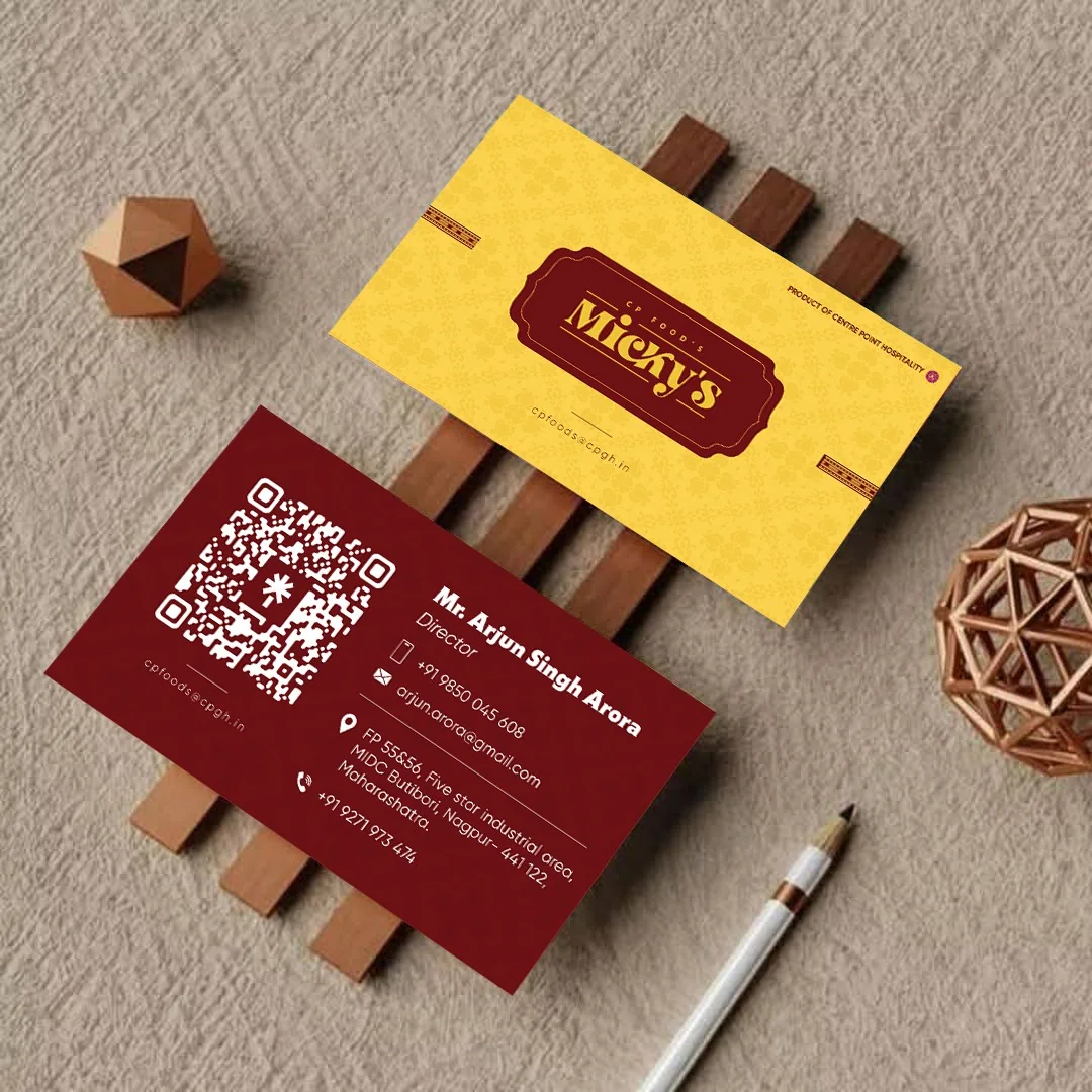
For the trade, Micky’s is the Rush Hour ka Right Hand: the product that keeps a professional kitchen moving when the orders pile up. The corporate merchandise, from the first identity EHR built, takes that line to trade partners and into expos. The polo and the apron say “I Survive Rush Hours. Ask me how.” The tote is a Rush Hour Survival Kit. The playing cards put the sales pitch in questions and answers: a question card names a kitchen problem, “Draining out your money too quickly?”, and its answer card says how Micky’s cuts fuel, manpower and wastage. The visiting card carries the same maroon and yellow. Each piece talks about the same thing, speed under pressure, which is what a professional kitchen buys Micky’s for.
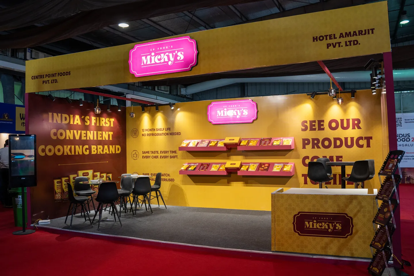
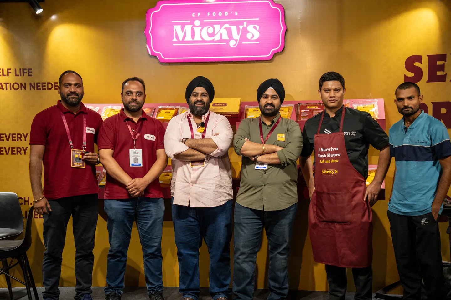
The B2B booth at Indus Food Expo 2026, carrying the identity into the trade space.
On Instagram
The pack colours, borders and Hinglish lines carry into the feed, from product reels to the team at Indus Food Expo 2026.
Rasoi ki Taiyaari, Micky’s ki Zimmedaari
Project Information
Micky’s by CP Foods comes from the kitchens of Centre Point Hospitality, which has cooked for the hospitality trade for four decades. It was built for professional kitchens: hotels, restaurants, cloud kitchens and caterers. It earned strong traction there. The next step was home, to moms.
The brand is named after Mr. Jasbir Singh G Arora, known as Micky, a colourful man whose hospitality always goes the extra mile. We turned that warmth and colour into the brand’s language.
The proposition is simple. Micky’s takes on the kitchen legwork, the pastes, the boiled grains, the gravy bases, so moms do the fun part and actually enjoy cooking. The problem was getting there: a brand built for chefs had to earn its place in a mom’s kitchen.
EHR Consulting built the GTM strategy, narrative and positioning, visual identity, packaging and content strategy. The first system, built from scratch, was maroon and yellow, as the brief asked, with a young Hinglish voice: “Rasoi ki Taiyaari, Micky’s ki Zimmedaari.” The identity and the voice stayed. The client found the packs more traditional than young. They suited HoReCa, but a retail shelf and the moms shopping it needed something younger, so we redid them before print.
The new packs take their language from truck art. It runs on every road from north to south, and each state’s trucks still speak their own culture. Micky’s is a pan-India range, so it works the same way. The wordmark, the dotted border and the badge row hold the range together, and each product family gets a bright colourway of its own. Six retort pouches and five spout pouches make up the launch range. On social, the pack identity carries into every post, and a new comic-strip IP gives each audience its own stories. The result is the product professional kitchens already trust, ready for a mom’s kitchen.
Ready when you are.
Book a call Rezidenext case