Rezide: case study
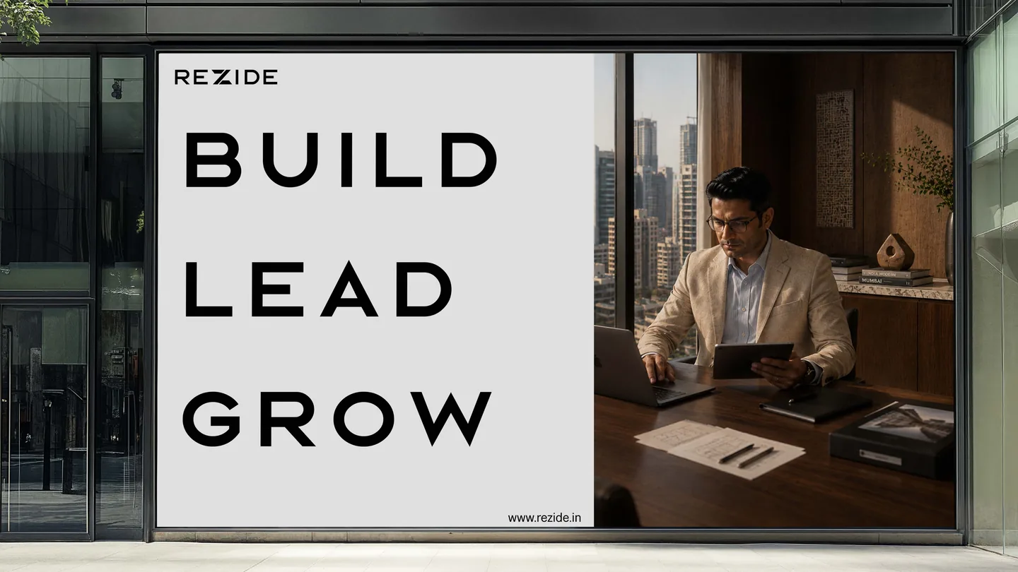
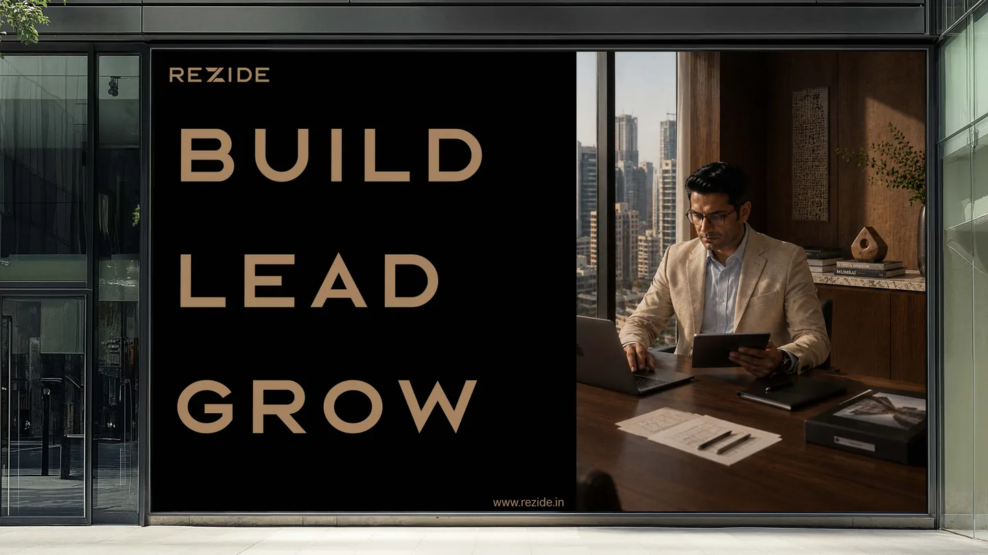
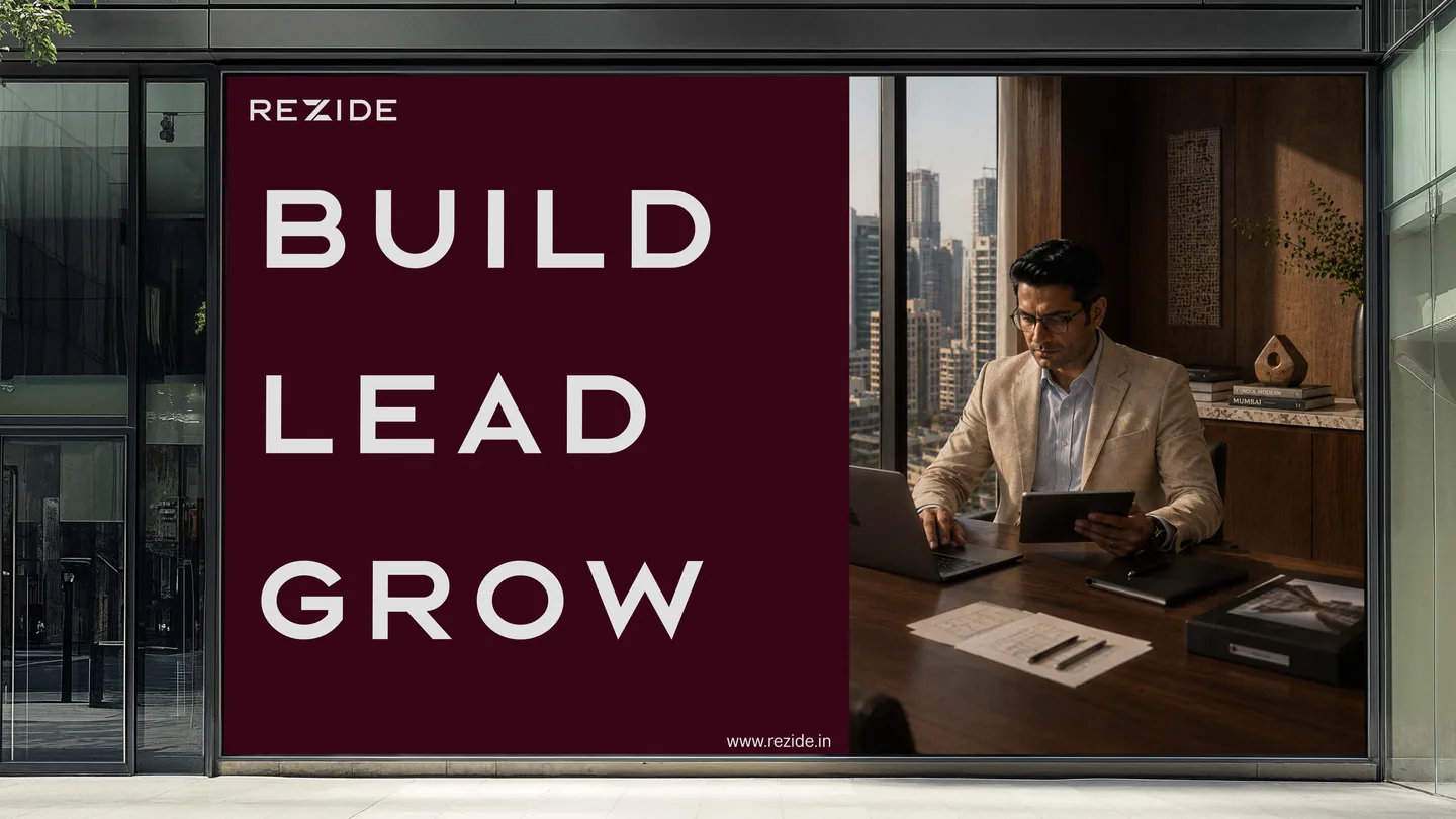
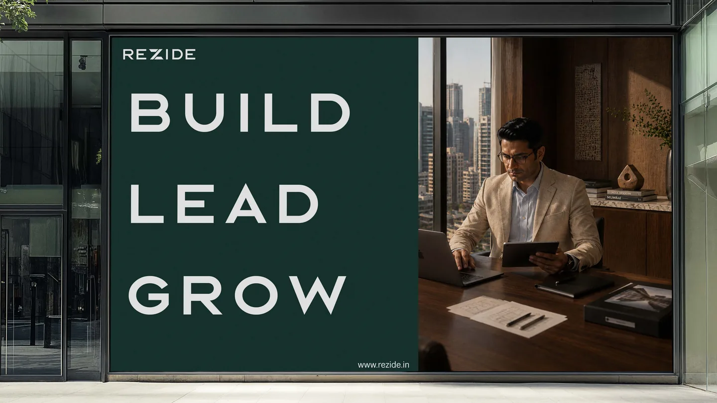
One billboard, four colourways. The same system in every mode.
The Challenge
Top of their game. Stuck at the desk.
India’s leading realtors work to a high professional standard. They win on reputation and close on trust. Yet much of their day still goes to clunky CRM software and heavy admin: data entry, follow-ups, paperwork. The hours their relationships need go to the desk instead. Rezide, founded in Mumbai in 2026 by Rukmani and Viraj, set out to change that. Before the product could earn their trust, the brand had to.
The Idea
A new way to handle admin
Rezide is a new way to look at admin. It covers more than 65 data points and comes with a built-in marketing team, so it does the legwork. The realtor opens the app and tells Rezide what needs doing. The time comes back to the relationships, where deals actually close. The brand follows the same rule: composed, precise, premium by default.
A Z doesn’t sit quietly in a word. That’s why it’s there.
The founders wanted residential to sound sharper, more modern, smarter, and one letter carried all of it.
Its angle became three blades in the mark, and a system that keeps every edge precise.
 Primary
 Secondary
 Announcements only
 New features
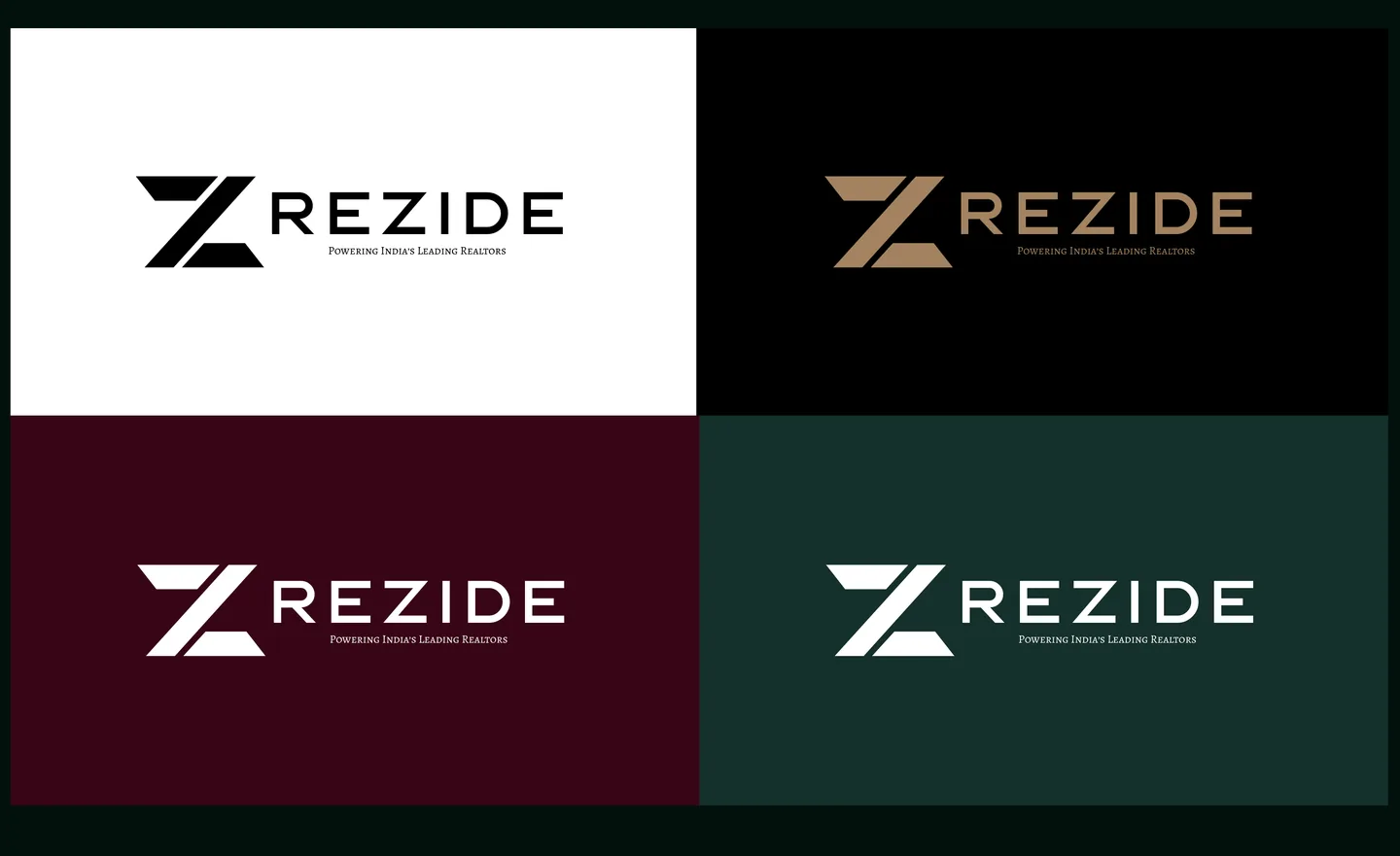
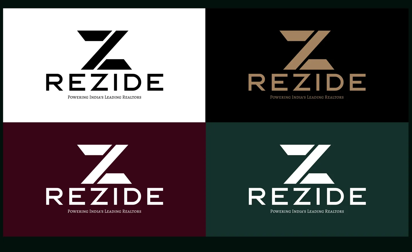
One mark. Four colourways. Four lockups: horizontal, vertical, wordmark, letter mark.
The mark takes the place of the Z in the wordmark, so the name and the mark are one shape.
Every lockup carries the line: Powering India’s Leading Realtors.
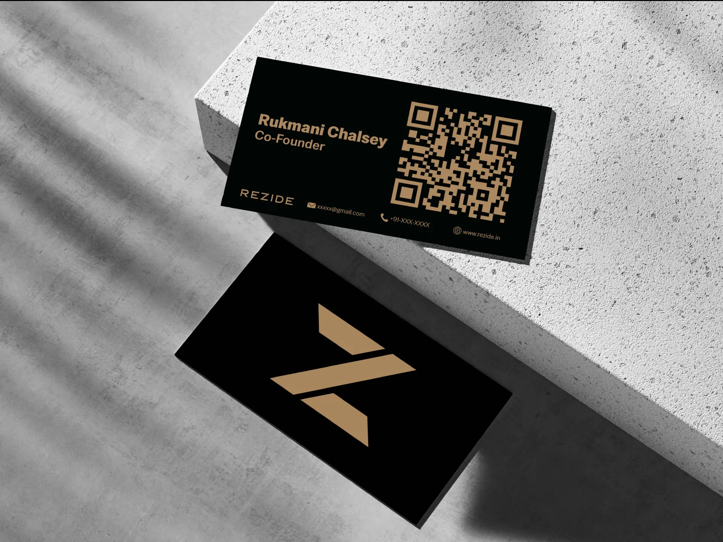
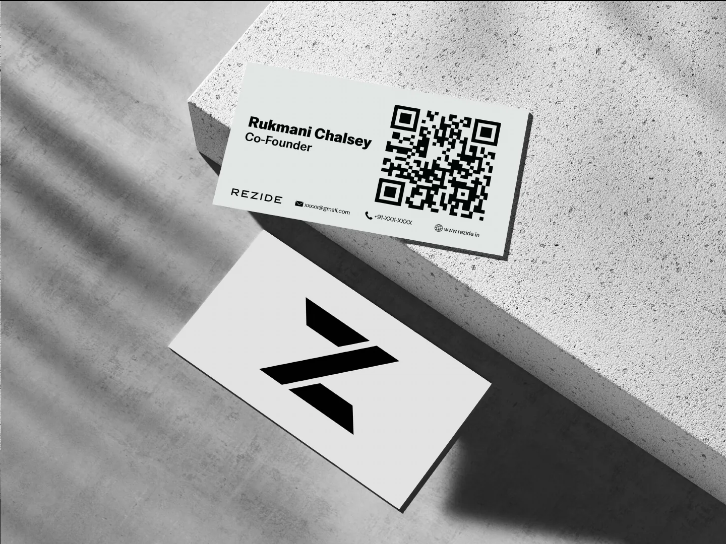
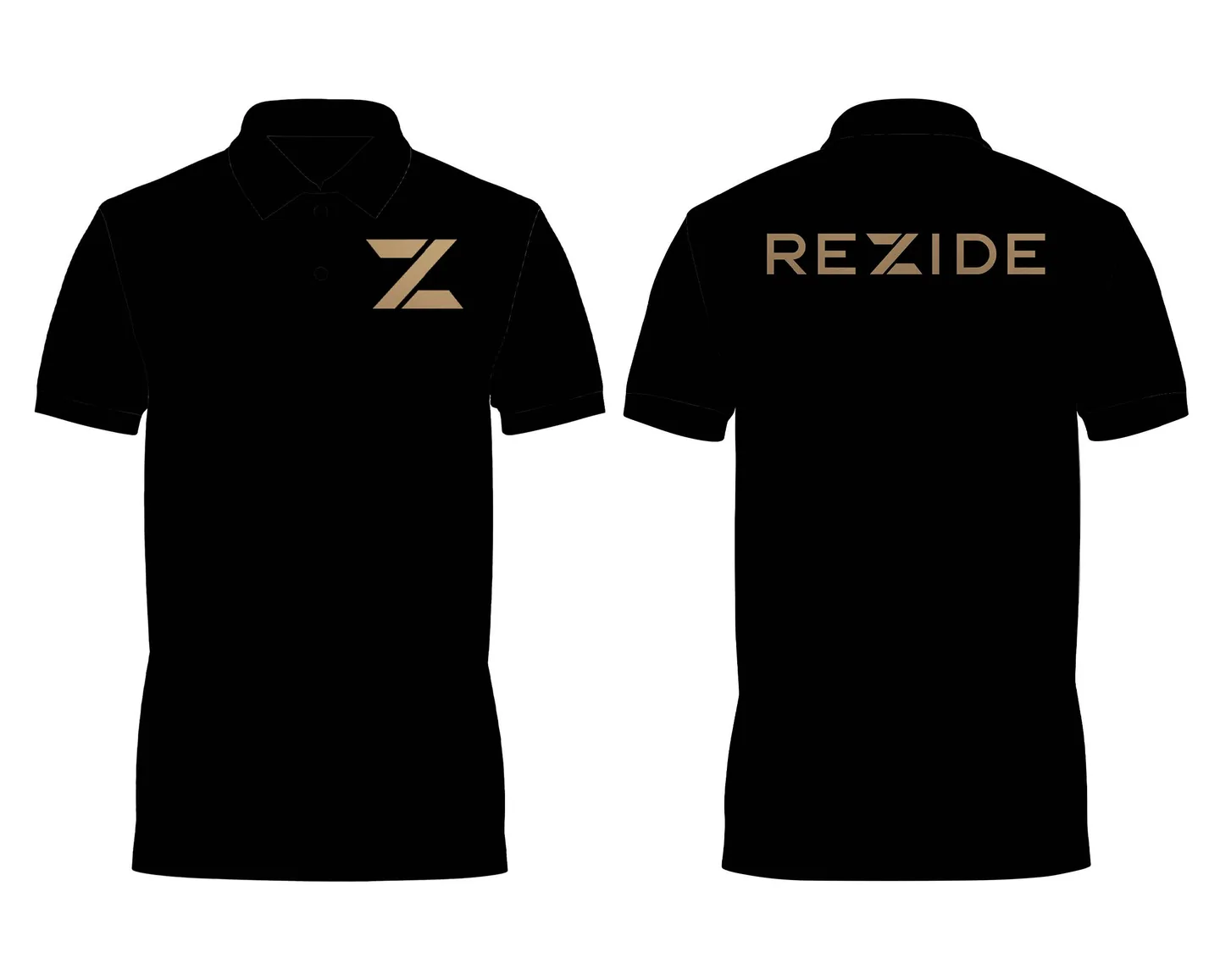
Two cards, two modes. Mocaccino on black. Black on white.
The same rules on paper as on screen.
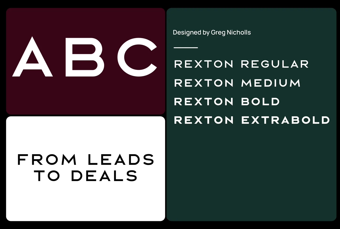
Rexton, for the logo. Montserrat, for primary content. Special Gothic, for secondary content.
Three faces, three jobs. From leads to deals.
Why Rezide exists
Real estate is one of the highest-stakes decisions a person makes. Financially, emotionally, generationally. Yet the systems guiding it are piecemeal, disconnected and low-trust. Better journeys begin with the professionals who facilitate them.
(Colour percentage usage)
Black and white do the everyday work. Mocaccino on black is Dark Mode. These are the only primary combinations.
Burgundy is only for announcements. Timber Green is only for new features. Never swapped, never used for anything else.
When the colour changes, the message has changed.
- Cloud#EDEFF7
- Smoke#D3D6E0
- Steel#BCBFCC
- Space#9DA2B3
- Graphite#6E7180
- Arsenic#40424D
- Phantom#1E1E24
- Black#000000
A black-and-white brand needs the steps in between.
Eight greys give the page its hierarchy: headings, subheadings, subtones.
Accents, not primaries. They sit with black and white to bring out what matters.
- Friendly, Professional, Formal
- Technical, Intelligent, Complex
- Promotional, Confident, Arrogant
- Functional, Purposeful, Inspirational
- Casual, Conversational, Flippant
- Luxurious, Premium, Elite
Professional, not formal. Intelligent, not complex. Confident, not arrogant. Premium, not elite.
The trusted advisor in the room, not a hyped-up startup.


One grid, one stroke. Every icon is drawn on a 32 by 32 grid with a 2px line.
From the everyday basics to the bed, the sofa and the building.
Social playbook
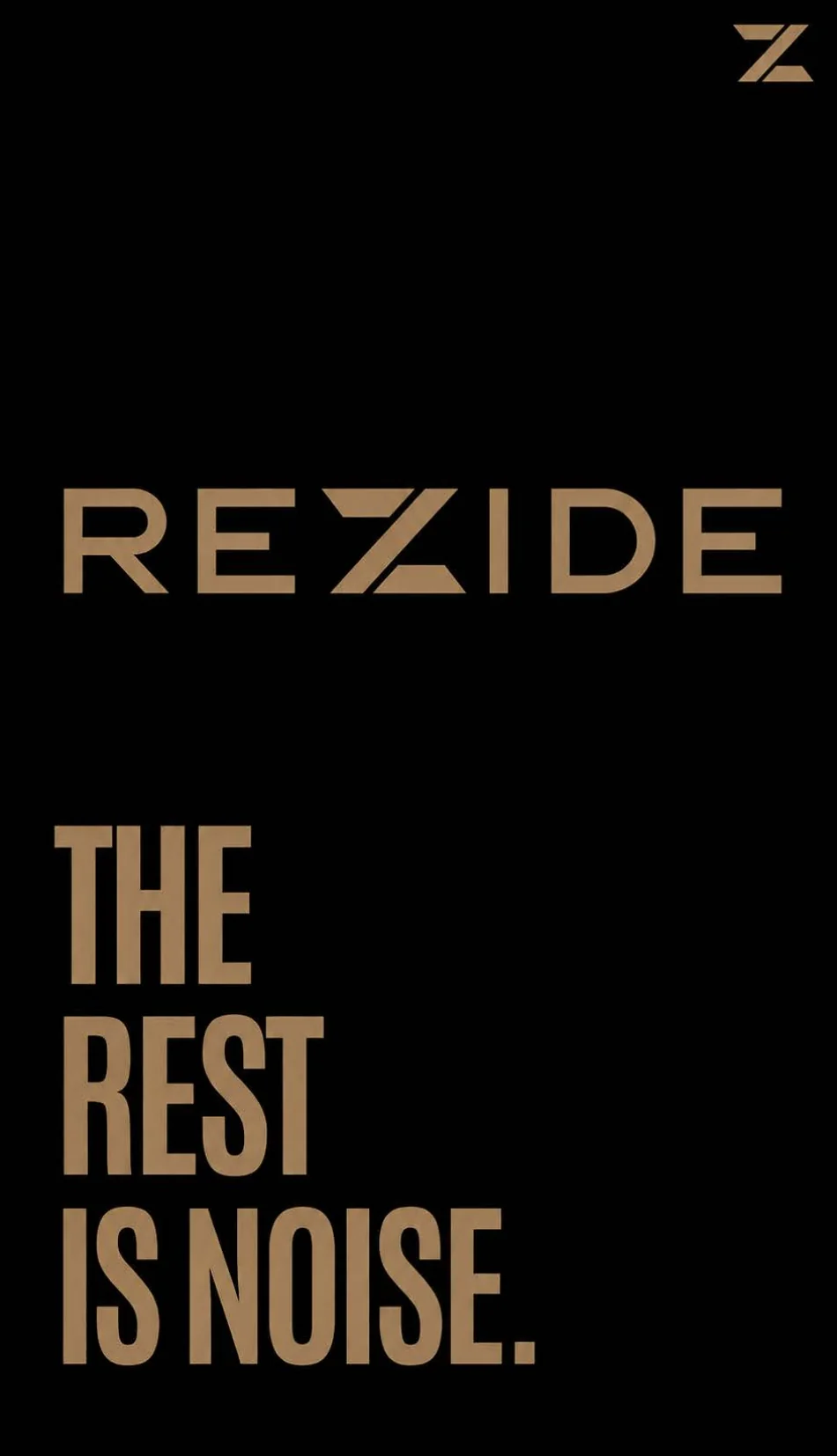
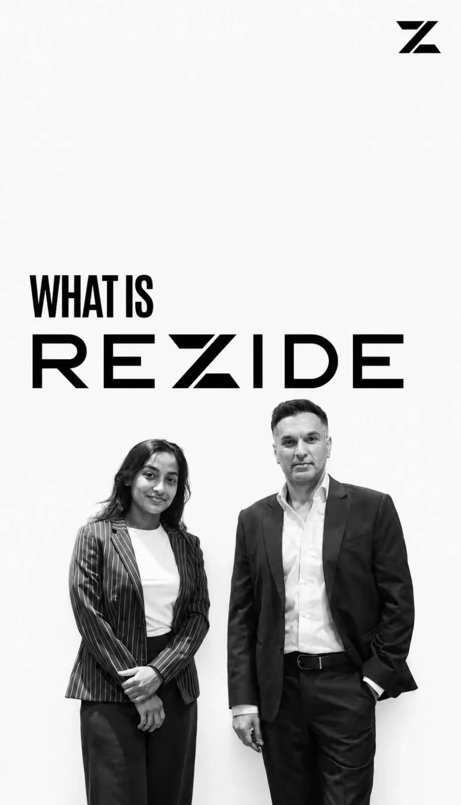
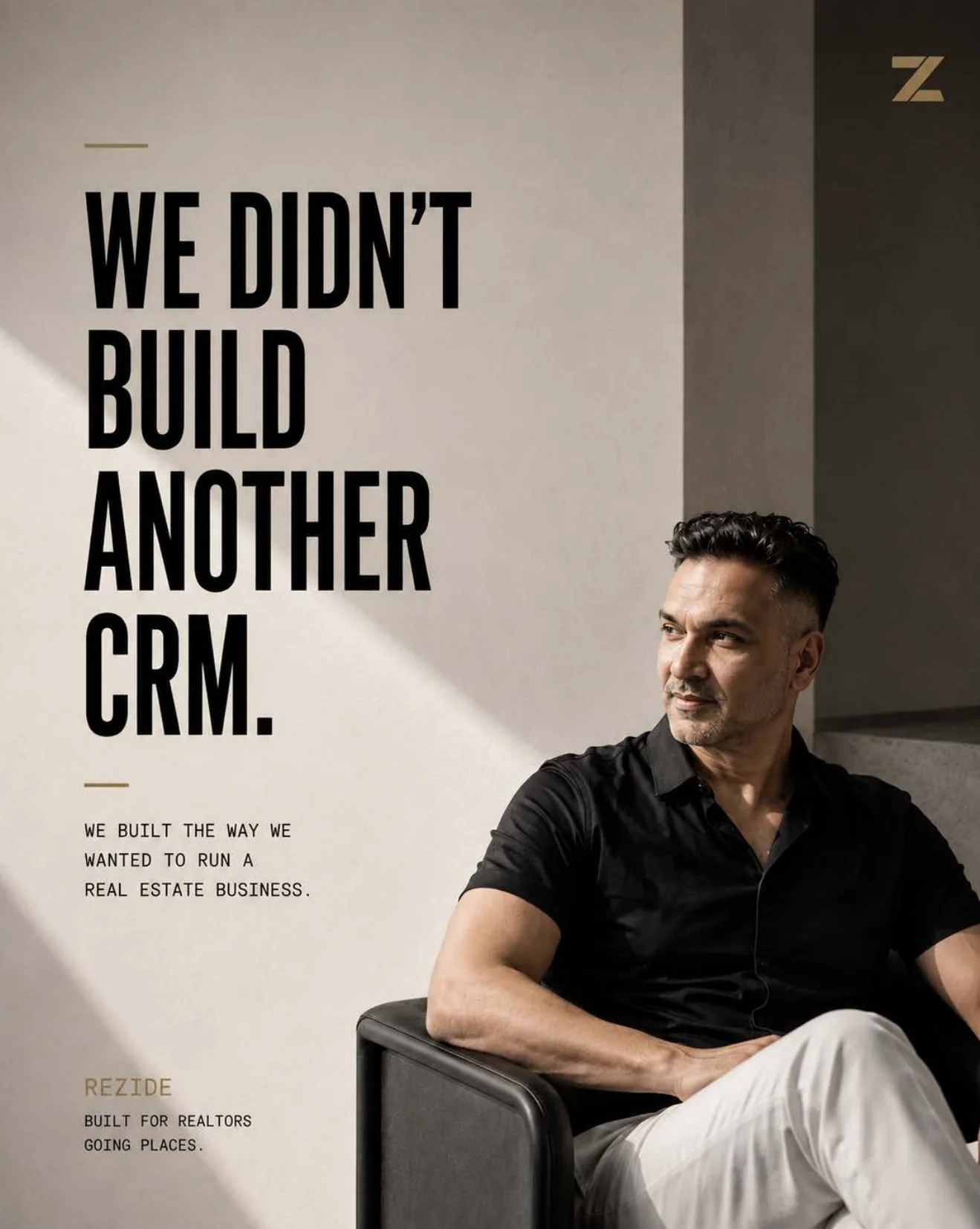
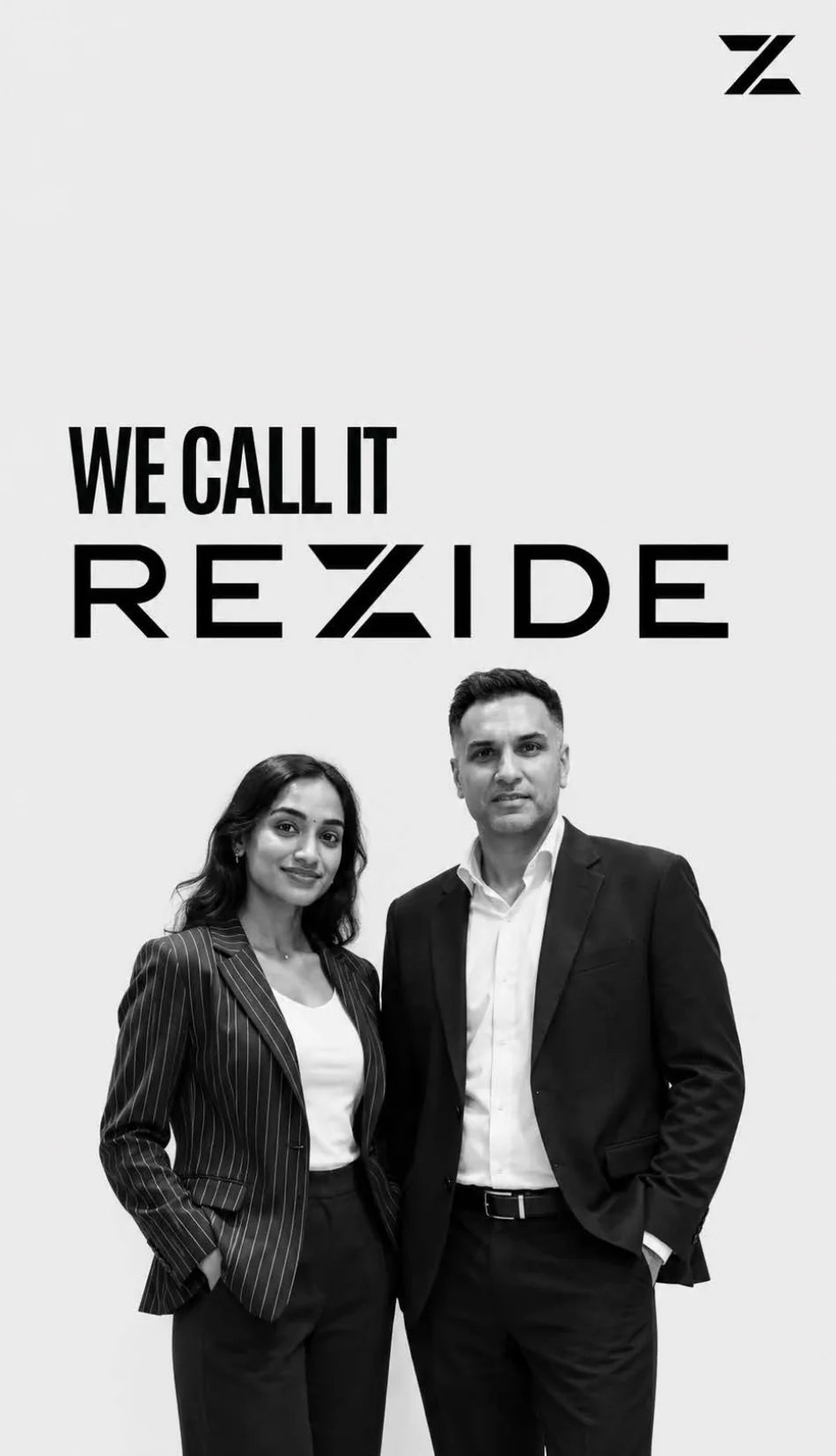
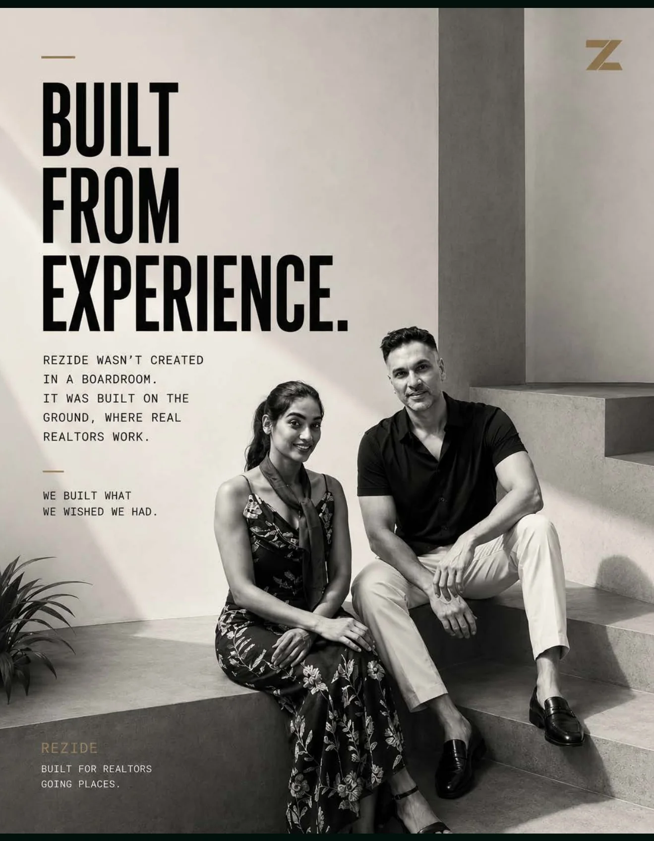
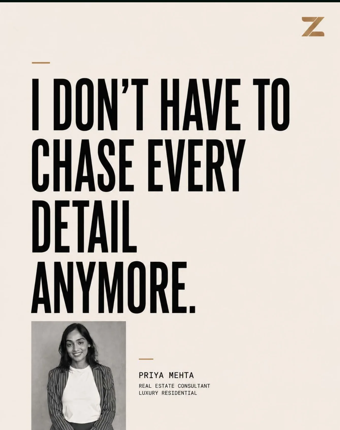
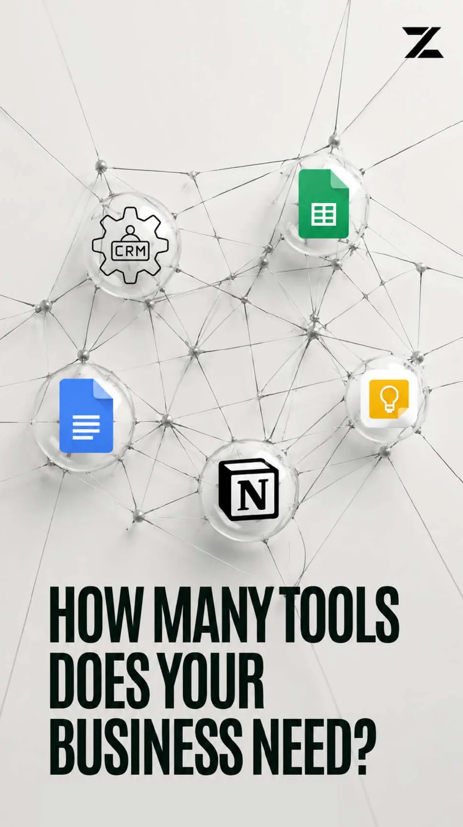
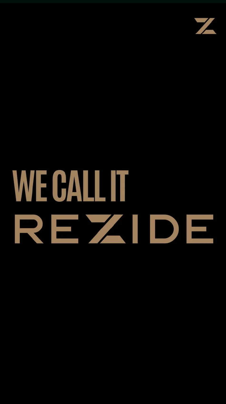
How Rezide talks on social: one claim per post, in the brand’s own colours.
“The rest is noise.” “We didn’t build another CRM.” “We call it REZIDE.”
Your time belongs with your clients. Rezide handles the rest.
What comes next
“Building the ecosystem that connects every part of the real estate journey, where every stakeholder, from realtor to buyer, seller, developer and lender, operates on the same connected and verified foundation.”
Project Information
Rezide is a founder-driven startup, founded in Mumbai in 2026 by Rukmani and Viraj, building an operating system for India’s leading realtors. Their business runs on relationships. Their days still go to admin: a client arrives through a referral, lives in a WhatsApp thread and is remembered through a spreadsheet and a follow-up call. Rezide covers more than 65 data points and comes with a built-in marketing team, so it does the legwork and a realtor’s time goes to people, not paperwork.
EHR Consulting built the brand: strategy, identity and playbook. The strategy started with purpose. Real estate is one of the highest-stakes decisions a person makes, and the systems guiding it are piecemeal and low-trust. Better journeys begin with the professionals who facilitate them. So Rezide is positioned as the operating system for premium real estate, not another CRM, built for outcomes, not features. The promise: “We orchestrate the complexity behind real estate, so the process is never the hard part.” The brand is a Sage with a Ruler’s bearing. It earns trust like an advisor and commands respect like a market leader. The master line: Powering India’s Leading Realtors.
The identity gives that a form. The name began as residential. The founders swapped the S for a Z because it sounded sharper, more modern and smarter, and that letter’s angle became the identity: three blades cut on one angle in the mark, and a system that keeps every edge precise. Colour works as a set of rules, not decoration. Black and white do the everyday work, Mocaccino on black is Dark Mode, and two colours are held in reserve: Burgundy only for announcements, Timber Green only for new features. Eight greys carry the hierarchy in between. Rexton sets the logo, Montserrat the primary content, Special Gothic the secondary. Every icon sits on one 32-pixel grid with a 2-pixel stroke. The voice is professional, not formal; confident, not arrogant; premium, not elite.
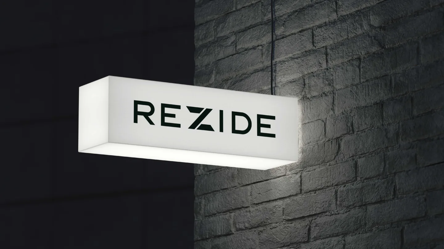
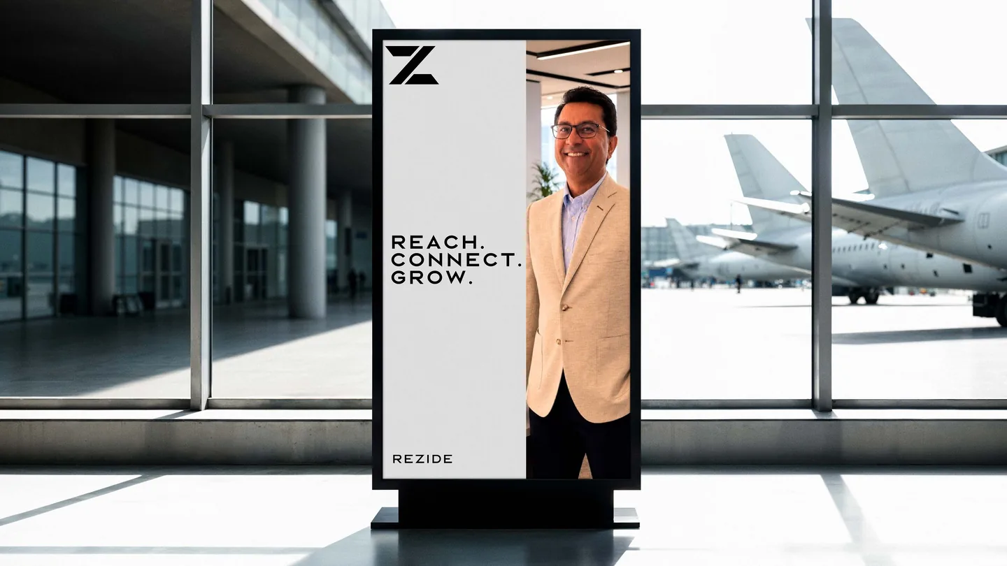
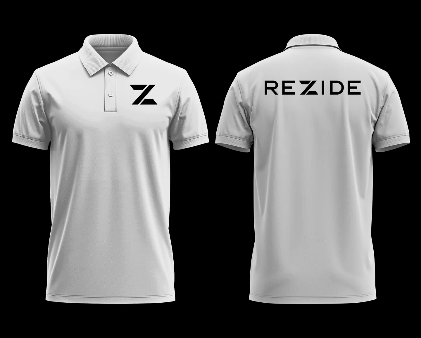
The playbook takes the system into the realtor’s world: social, billboards, airport standees, lightbox signs, stationery and merchandise.
The identity launched in 2026; the product is in beta. The result is a brand that looks like the business its users have already built.
Ready when you are.
Book a call Micky’snext case